Preview image. Unlock full-res
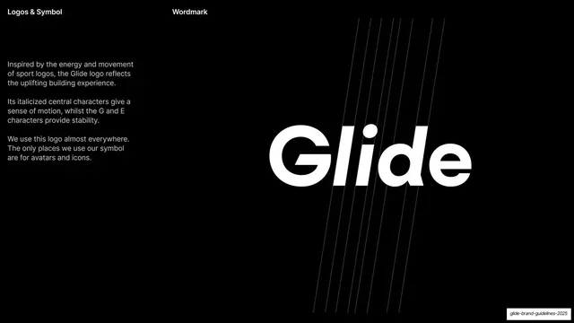
Black slide explaining the wordmark, with a left text column and a large white "Glide" logo crossed by faint diagonal speed lines on the right.
Summary
A logo-rationale slide: a narrow left explanation column beside a large white italic "Glide" wordmark crossed by faint diagonal speed lines.
Visual description
Full-bleed black ground. Header reads "Logos & Symbol" left and "Wordmark" center. A narrow left column holds three short grey-white paragraphs explaining that the logo draws on sport-logo energy, that its italicized central characters give motion while the G and E provide stability, and that the wordmark is used almost everywhere. The right two-thirds shows a large white "Glide" wordmark with leaning central "li", overlaid by several faint diagonal hairlines that read as motion or speed streaks angling across the letters.
Key takeaway
Demonstrating a logo's design rationale visually: the faint diagonal lines literally illustrate the "motion" the copy describes. The fixed left-text / right-display split keeps the explanation and the artifact cleanly separated.
Reuse notes
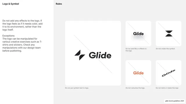
A reusable logo-explanation layout for brand guidelines. The diagonal speed-line treatment is specific to a motion-themed mark; reuse it only where movement is part of the brand story. Pairs with the clear-space and misuse slides that follow.
From this deck: Wordmark rationale with diagonal lines
View deck








More like this







Keep what you find
A free account saves references to boards and can send you a weekly email of picks based on what you save.
To see every result, go Pro.