Preview image. Unlock full-res
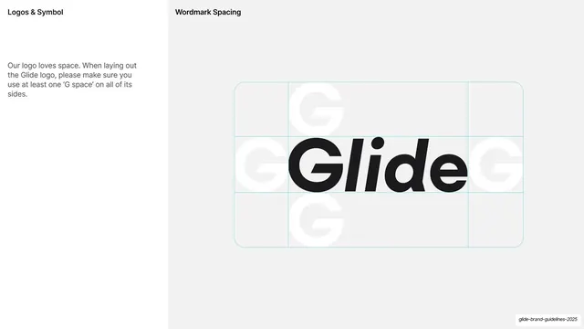
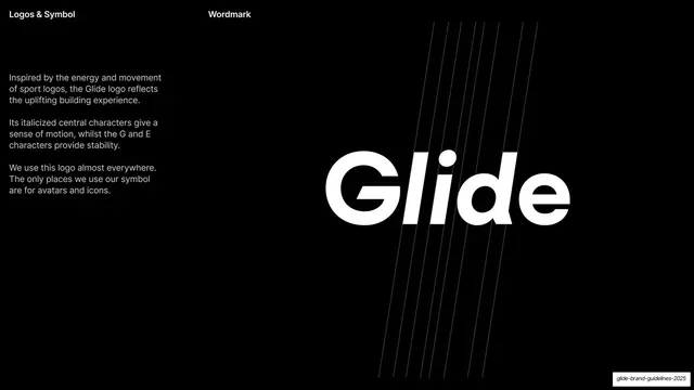
Light slide showing the Glide wordmark inside a clear-space grid built from ghosted G letterforms with cyan guide lines.
Summary
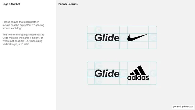
A clear-space diagram: the black "Glide" wordmark centered in a rounded-rectangle grid whose padding is measured in ghosted "G" letterforms, marked with cyan guide lines.
Visual description
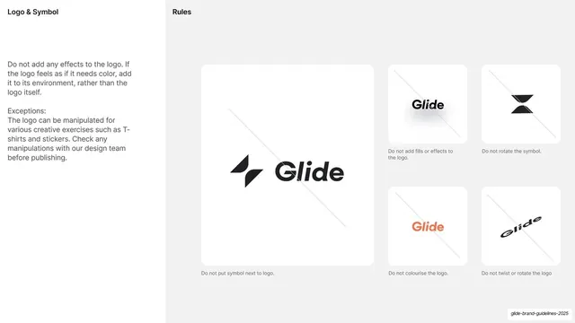
Light off-white ground. Header reads "Logos & Symbol" left and "Wordmark Spacing" center. A short left column explains that the logo needs at least one "G space" of clear room on every side. The right two-thirds shows the black italic "Glide" wordmark centered inside a rounded-corner bounding box divided into a three-by-three grid by thin cyan lines; faint light-grey "G" letterforms fill the surrounding cells to visualize the minimum exclusion zone.
Key takeaway
Using the brand's own letterform (the "G") as the unit of measurement for clear space, drawn as ghosted shapes inside a cyan-lined grid. It makes the spacing rule self-documenting and on-brand rather than abstract.
Reuse notes
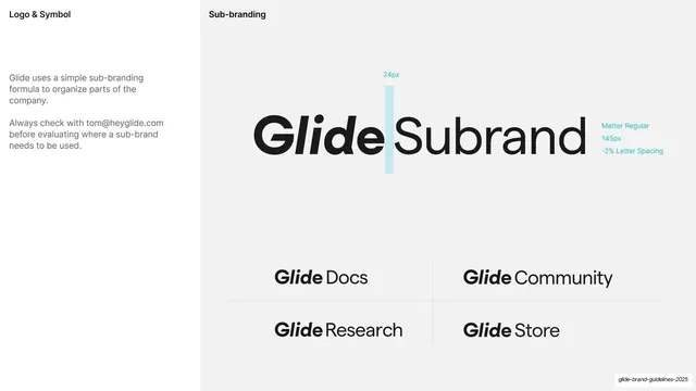
A standard, highly reusable clear-space diagram for any logo guideline. The cyan construction lines and brand-letter spacing unit are easy to adapt to any mark. Pairs directly with the wordmark rationale and misuse slides.
From this deck: Wordmark clear-space G-grid diagram
View deck








More like this









Keep what you find
A free account saves references to boards and can send you a weekly email of picks based on what you save.
To see every result, go Pro.