Preview image. Unlock full-res
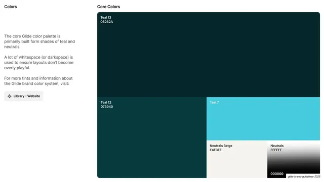
Light slide presenting the core teal-and-neutral palette as a bento grid of named, hex-coded color blocks.
Summary
The core-color slide: a bento grid of named, hex-labeled swatches dominated by deep teals and neutrals, with a short explanation and a library button on the left.
Visual description
Light off-white ground. Header reads "Colors" left and "Core Colors" center. A left column explains the palette is built mainly from teal and neutral shades, that whitespace (or "darkspace") keeps layouts from feeling overly playful, and includes a small "Library - Website" button. The right two-thirds is a bento grid of color blocks, each labeled in-corner with a name and hex: a large "Teal 13 / 05262A" block top, "Teal 12 / 073940" and a bright "Teal 7" (cyan) below, and two smaller neutral cells, "Neutrals Beige / F4F3EF" and a "Neutrals" block running white (FFFFFF) to black (000000) as a vertical gradient swatch.
Key takeaway
Presenting a core palette as a proportional bento grid where the biggest block is the dominant color, so the layout itself communicates color hierarchy. In-corner name plus hex labels keep it immediately usable.
Reuse notes
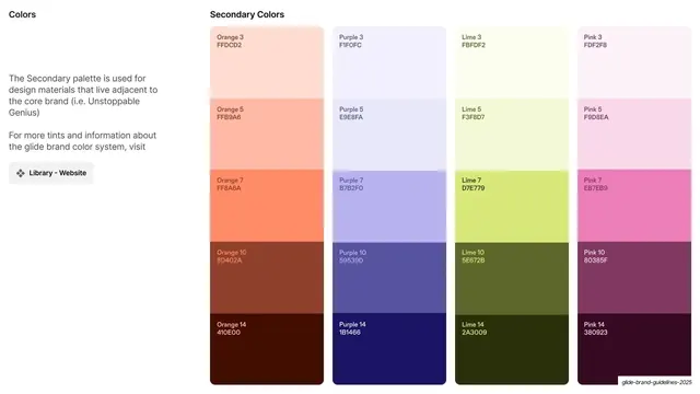
A reusable core-palette slide for any brand or design-system guideline. The proportional bento sizing is a neat way to imply usage weight. Pairs with the secondary-color ramp slide that follows.
From this deck: Core color palette grid
View deck








More like this


Keep what you find
A free account saves references to boards and can send you a weekly email of picks based on what you save.
To see every result, go Pro.