Preview image. Unlock full-res
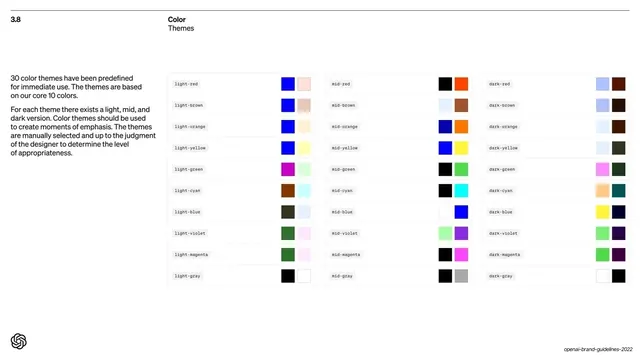
A dense three-column grid of thirty named color themes (light, mid, dark across ten hues), each as a labeled two-swatch pair.
Summary
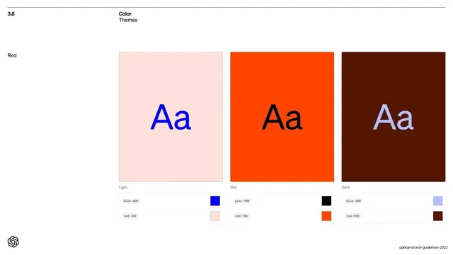
The "3.8 Color / Themes" overview: thirty predefined themes laid out as a three-column grid (light, mid, dark variants of ten core hues), each theme a named row with a two-swatch pair.
Visual description
White background with the "3.8 / Color / Themes" header and a short left-column note ("30 color themes have been predefined..."). Three columns headed implicitly Light, Mid and Dark each list ten themes top to bottom (red, brown, orange, yellow, green, cyan, blue, violet, magenta, gray). Every row shows the theme name in small Söhne Mono on the left (e.g. "light-red", "mid-cyan", "dark-violet") and two adjacent color squares on the right: a foreground/accent color and a background color, often high-contrast duotone pairs like blue on pale pink, or black on bright green.
Key takeaway
Encoding a whole theming system as a single scannable grid of named, two-swatch pairs, with light/mid/dark as columns. Naming each theme in monospace ("light-red") ties the design swatch directly to a code token. Showing every theme as a foreground-on-background pair previews real usage, not just isolated colors.
Reuse notes
An excellent reference for documenting a multi-theme or token-based color system at a glance. The named-pair grid scales to any number of themes. Reuse the monospace theme names as literal CSS/design-token identifiers to keep design and code in sync.
From this deck: Thirty color themes grid
View deck




More like this

Keep what you find
A free account saves references to boards and can send you a weekly email of picks based on what you save.
To see every result, go Pro.