Preview image. Unlock full-res
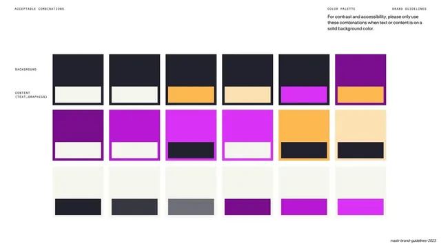
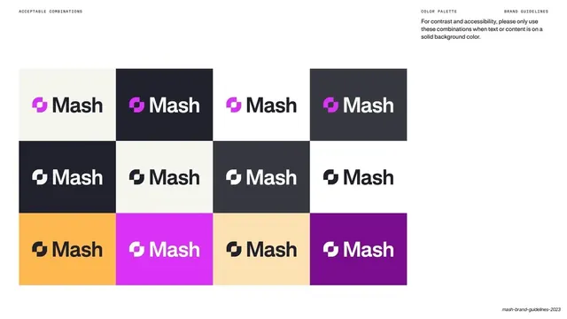
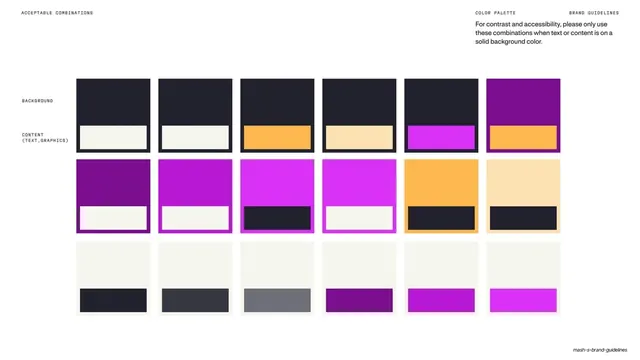
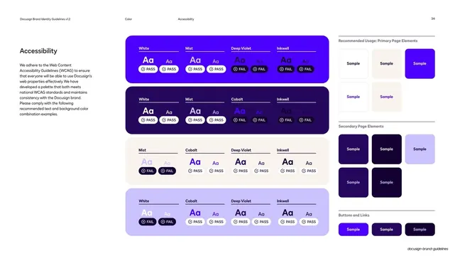
Light slide charting approved background-and-content color pairings as a grid of swatch cards, with a short accessibility note top-right.
Summary
An acceptable-combinations page: a grid of cards each pairing a large background swatch with a smaller content-color bar inside it, demonstrating only the approved, legible color pairings.
Visual description
Warm cream background, monospace header "ACCEPTABLE COMBINATIONS" left and "COLOR PALETTE" / "BRAND GUIDELINES" right, with a short paragraph top-right stating these are the only pairings to use when text or content sits on a solid background. Down the left, two row labels: "BACKGROUND" and "CONTENT (TEXT, GRAPHICS)". The grid runs three rows of six cards. Top row: charcoal backgrounds carrying cream, orange, beige, magenta and (on a purple ground) orange content bars. Middle row: purple and magenta backgrounds carrying cream or charcoal bars, plus orange and beige grounds with charcoal bars. Bottom row: cream backgrounds carrying charcoal, gray, purple and magenta bars. Each card shows the content color as a smaller block sitting on the larger background block.
Key takeaway
Expressing contrast rules as literal background-plus-content swatch cards rather than ratio numbers, so designers copy a pairing directly. The two-axis labeling (background vs content) makes the intended reading order obvious.
Reuse notes
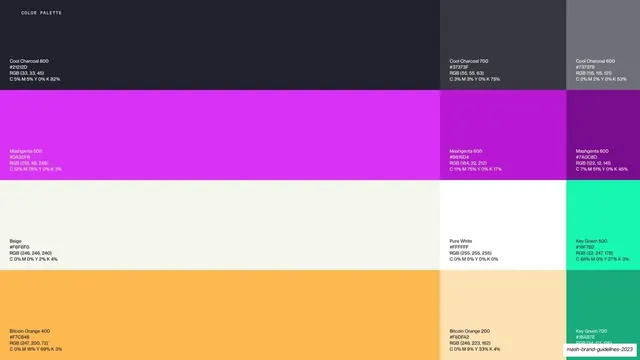
A practical accessibility/contrast page that non-designers can use without reading WCAG values. Show only the sanctioned pairings so the grid is a pick-list. Pair with the master palette page and a do's-and-don'ts page.
From this deck: Mash acceptable color combinations
View deck



































More like this
Keep what you find
A free account saves references to boards and can send you a weekly email of picks based on what you save.
To see every result, go Pro.