Preview image. Unlock full-res
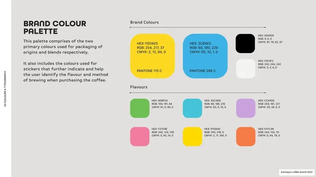
Light-grey palette page with three large primary swatches (yellow, blue, black plus white) over a six-swatch flavour row, each with HEX, RGB, CMYK and Pantone values.
Summary
The color page: three large primary swatches over a six-swatch flavour row, each labeled with full color values.
Visual description
Light-grey (#F5F4F2) ground, vertical edge label. Top-left, a bold two-line "BRAND COLOUR PALETTE" heading and two short paragraphs. The right side splits into two labeled groups on thin rules. "Brand Colours": three large rounded swatches, yellow (HEX FED925 / PANTONE 115 C), blue (HEX 3CB4E5 / PANTONE 298 C), and a black/white pair, each with HEX, RGB and CMYK printed inside or beside. "Flavours": a 3x2 grid of smaller rounded swatches (green, cyan, purple, pink, yellow, orange) each with HEX, RGB, CMYK. Rounded-corner swatches throughout.
Key takeaway
Splitting the palette into a "brand colours" tier (large swatches, Pantone included) and a "flavours" tier (smaller swatches) so hierarchy is obvious at a glance. Printing full HEX/RGB/CMYK on each swatch keeps it production-ready. The rounded swatch corners echo the rounded type.
Reuse notes
A reusable, production-grade color page. The two-tier structure suits brands with a small core palette plus a larger functional/secondary set. Include Pantone only where it matters (packaging). Keep swatch corner radius consistent with the brand's shape language.
From this deck: Brand colour palette
View deck






More like this





Keep what you find
A free account saves references to boards and can send you a weekly email of picks based on what you save.
To see every result, go Pro.