Preview image. Unlock full-res
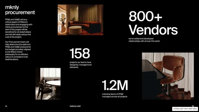
A black interiors detail slide pairing an intro paragraph and a "10 Awards" stat with four scattered interior project thumbnails.
Summary
The interiors deep-dive: a short intro paragraph and a giant "10 Awards" stat anchor a loose scatter of four interior project thumbnails on black.
Visual description
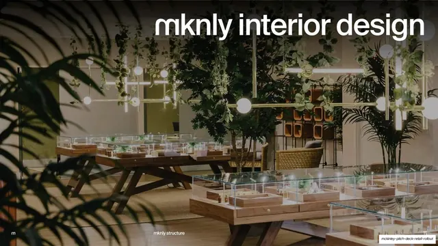
Black ground, white type, same template as the architecture detail slide. Top-left, a lowercase heading "mknly interior design" with two short paragraphs about bridging micro to macro scales and elevating the human experience. Four interior thumbnails sit at varied sizes and offsets: a warm boutique with a rust velvet daybed (top-center), a pale wellness retail interior with a green stone and timber feature wall and a gold "Saje" wordmark (right, bleeding off-edge), a dim lounge with a cream boucle sofa (lower-left), and a stone-and-cobalt service counter (lower-right). Between them, an oversized "10 Awards" with the caption "for interior design in 2023". Footer: "m" left, "reduce cost" center, "12" right.
Key takeaway
The repeat of the detail-slide template proves its value: swap the photos and the stat, keep the layout, and the deck stays cohesive while each discipline gets its own evidence. Letting one thumbnail bleed off the right edge keeps the scatter from feeling boxed.
Reuse notes
Third application of the intro-plus-stat-plus-thumbnails recipe; by now the audience reads it as the deck's "proof" rhythm. The award stat does double duty as social proof. As with the other grid slides, success depends on tonally consistent imagery so the off-grid scatter coheres.
From this deck: mknly interior design intro and project grid
View deck