Preview image. Unlock full-res
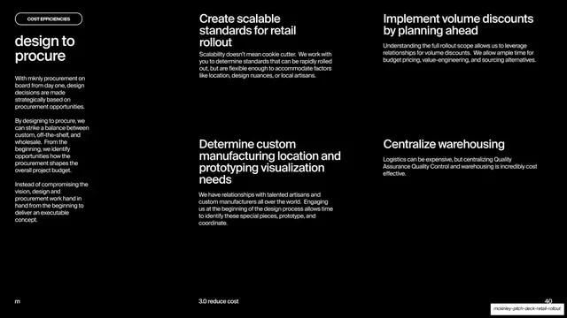
Dark slide with a "cost efficiencies" pill and lowercase "design to procure" heading on the left, and a four-quadrant grid of titled paragraphs on the right.
Summary
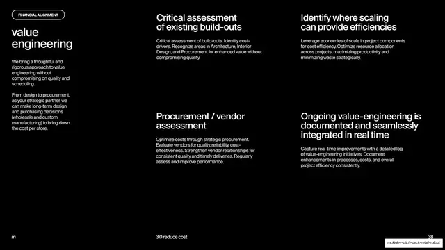
A black content slide that introduces "design to procure" in a left column and explains it through a two-by-two grid of four short titled paragraphs, matching the value-engineering slide's layout.
Visual description
Solid black background with white type. The left column carries a rounded pill outline labeled "COST EFFICIENCIES", a lowercase two-line heading "design to procure", and three short intro paragraphs about procurement-led design decisions. The right two-thirds is a four-quadrant grid: each cell has a bold sentence-case sub-head ("Create scalable standards for retail rollout", "Implement volume discounts by planning ahead", "Determine custom manufacturing location and prototyping visualization needs", "Centralize warehousing") over a small body paragraph. The footer holds the lowercase "m" mark, a centered "3.0 reduce cost" label, and the page number "40".
Key takeaway
The repeated intro-plus-2x2-grid template, reused here with a different pill label and heading, shows how one fixed layout creates rhythm across a section while the content changes. Consistency across consecutive slides reads as a system.
Reuse notes
Use as part of a paired set of explainer slides where you want each to feel like a member of the same family. Keep the four cell paragraphs balanced in length. Like its sibling slide, the all-text black treatment is premium but unforgiving of weak or uneven copy.
From this deck: Design to procure four-point breakdown
View deck























More like this





Keep what you find
A free account saves references to boards and can send you a weekly email of picks based on what you save.
To see every result, go Pro.