Preview image. Unlock full-res
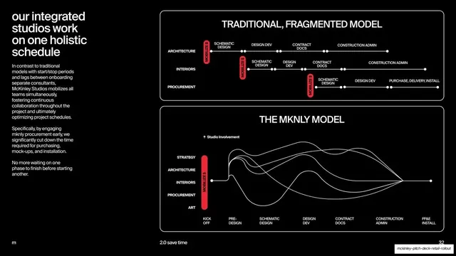
Black split slide comparing a traditional staggered-phase timeline against the overlapping mknly model, drawn as a node timeline above flowing curves.
Summary
A black comparison slide contrasting the staggered "traditional, fragmented model" against the overlapping "mknly model", shown as a node timeline above a set of intertwined flow curves.
Visual description
Pure black background. The left column holds a headline, "our integrated studios work on one holistic schedule", over three short explanatory paragraphs in grey. The right two-thirds stacks two outlined panels. The top panel, "TRADITIONAL, FRAGMENTED MODEL", shows three offset horizontal node timelines (Architecture, Interiors, Procurement), each with a red "MOBILIZE $" pill starting at a different point, illustrating staggered sequential phases. The bottom panel, "THE MKNLY MODEL", lists five disciplines (Strategy, Architecture, Interiors, Procurement, Art) sharing one tall red "MOBILIZE $" bar at kickoff, then a tangle of thin white curves rising and converging across labeled phases from KICK OFF to FF&E INSTALL. Footer: "m", "2.0 save time", page "32".
Key takeaway
Visualizing "fragmented versus integrated" as two panels: rigid staggered node timelines on top, and flowing overlapping curves below, so the argument is read instantly. The single red "mobilize" marker (staggered three times above, unified once below) is a sharp one-color device for the whole point.
Reuse notes
A strong process-comparison slide for any "old way versus our way" timeline argument, especially integrated-delivery or platform pitches. The curves convey simultaneity better than bars would. It is information-dense; give it presenter time and keep the left-column copy tight so the diagram leads.
From this deck: Fragmented vs mknly model timeline diagram
View deck



























More like this







Keep what you find
A free account saves references to boards and can send you a weekly email of picks based on what you save.
To see every result, go Pro.