Preview image. Unlock full-res
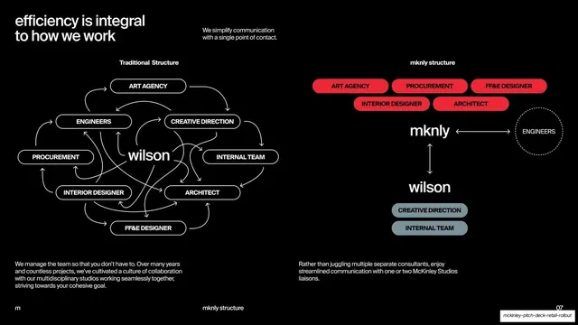
A black slide contrasting a tangled traditional org web of outlined pills against a clean simplified mknly structure built from red and slate pills.
Summary
A side-by-side org diagram: a chaotic traditional structure of cross-linked outlined pills on the left versus a clean, hierarchical mknly structure of red and slate pills on the right.
Visual description
Black ground, white type. A lowercase headline top-left, "efficiency is integral to how we work", with a short note beside it about a single point of contact. Two labeled diagrams fill the slide. "Traditional Structure" (left) is a dense tangle: ten outlined black-and-white pills (art agency, engineers, creative direction, procurement, interior designer, architect, FF&E designer, internal team, plus "wilson" set large in the middle) connected by a confusing web of curved arrows. "mknly structure" (right) is deliberately orderly: a row of red pills (art agency, procurement, FF&E designer, interior designer, architect) feeds into a large "mknly" node, which links by single clean arrows to a dotted "engineers" circle and down to "wilson", with two slate pills (creative direction, internal team) beneath. Short captions sit under each. Footer: "m" left, "mknly structure" center, "07" right.
Key takeaway
Arguing a value prop visually by contrast: a deliberately messy node-and-arrow web next to a calm, near-linear one makes "we simplify your structure" self-evident without a single metric. Using red for the partner's roles and slate for the client's roles color-codes who does what.
Reuse notes
A persuasive "before vs after" device for any service that promises to reduce coordination overhead. The trick is to genuinely over-tangle the "before" diagram; a tidy comparison kills the point. Pill-and-arrow diagrams stay legible only at this node count, so do not add more.
From this deck: Traditional vs mknly org-structure diagram
View deck






























More like this








Keep what you find
A free account saves references to boards and can send you a weekly email of picks based on what you save.
To see every result, go Pro.