Preview image. Unlock full-res
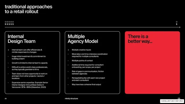
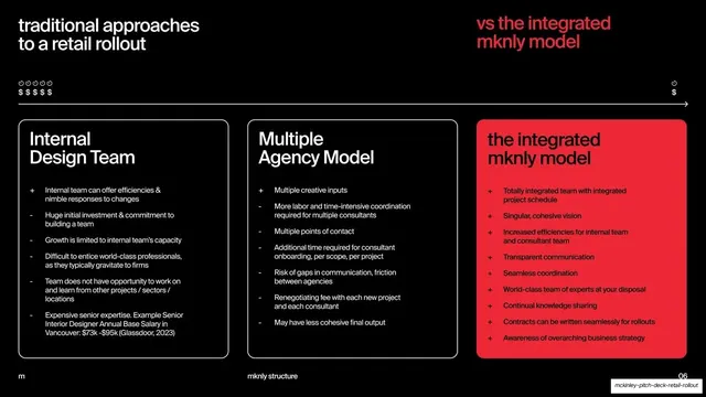
A black comparison slide with two outlined pro-and-con cards for internal and multi-agency models and an empty red teaser card reading "There is a better way...
Summary
The first half of a comparison: two outlined black cards listing the pros and cons of an internal design team and a multiple-agency model, with a third solid-red card teasing "There is a better way..."
Visual description
Black background, white type, red accent. A lowercase headline top-left, "traditional approaches to a retail rollout", sits above a horizontal cost-and-time axis drawn with small clock and dollar glyphs and an arrow running across the slide. Below sit three equal rounded cards. Card one, "Internal Design Team", and card two, "Multiple Agency Model", are black with thin white outlines and bulleted plus/minus lists (a leading "+" or "-" marking each pro or con). Card three is a solid red panel holding only a large heading, "There is a better way...", left intentionally empty as a cliffhanger into the next slide. Footer: "m" left, "mknly structure" center, "05" right.
Key takeaway
Building suspense across two slides by leaving the third comparison card empty and red, so the audience anticipates the reveal. The plus/minus prefix is a compact, scannable way to mix pros and cons inside one card.
Reuse notes
A reusable "old way vs new way" device for pitches that argue for a different model. The empty teaser card only works as a matched pair with the payoff slide; do not use it standalone. The horizontal cost/time axis is a nice touch but reads as decorative more than quantitative.
From this deck: Traditional approaches comparison cards (two of three)
View deck








More like this





Keep what you find
A free account saves references to boards and can send you a weekly email of picks based on what you save.
To see every result, go Pro.