Preview image. Unlock full-res
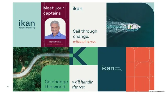
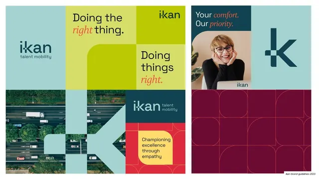
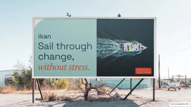
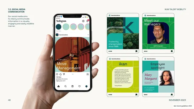
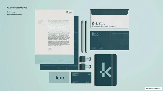
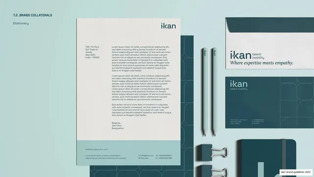
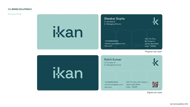
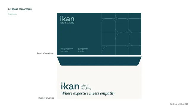
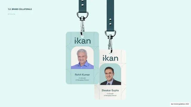
A 55-slide brand guideline deck for IKAN, a workforce mobility company, built on a calm midnight-green and pale-mint two-tone system, a custom "i-kan" wordmark with a window-notched "k", and a grotesque-plus-serif-italic type pairing accented in coral.
Summary
A 55-slide brand guideline for IKAN, a workforce mobility solutions company (November 2023). Its whole personality comes from a disciplined two-tone palette (midnight-green and pale mint) paired with a custom "i-kan" wordmark whose "k" carries a small square "window", and a type system that mixes a geometric grotesque with a coral serif italic for emphasis. The labeled portion here covers slides 1 to 18: brand introduction, strategy, verbal identity, and the logo chapter.
Visual description
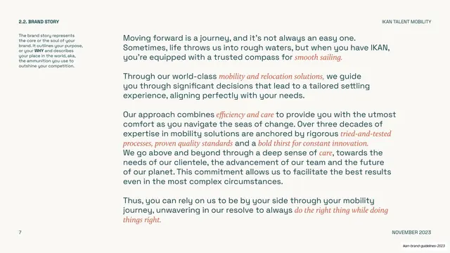
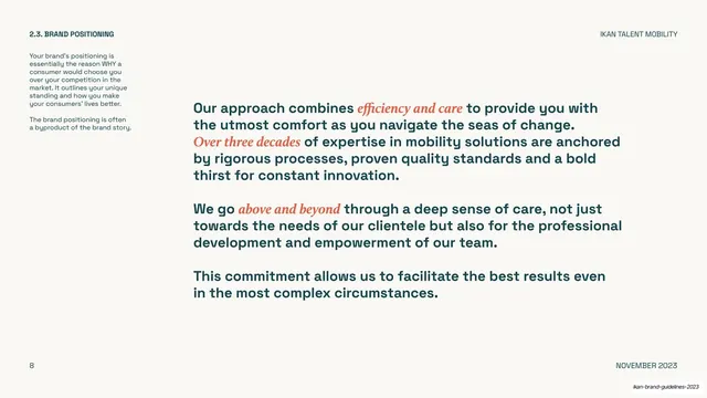
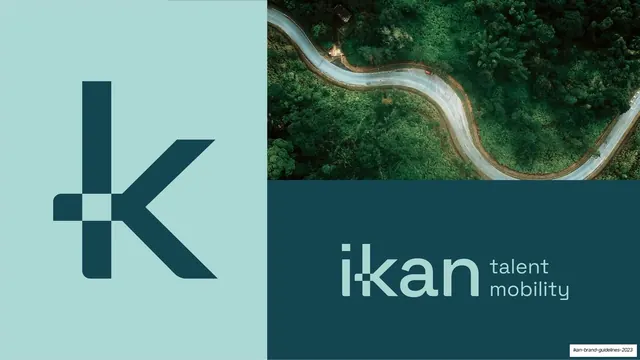
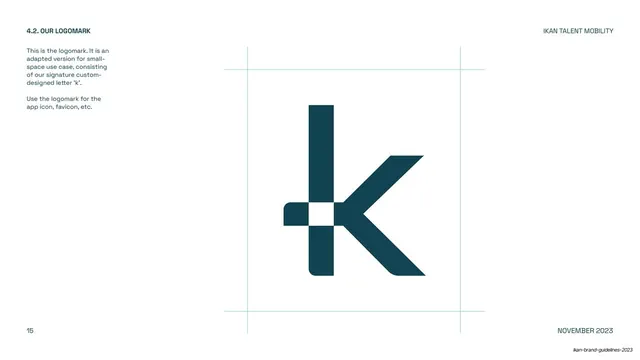
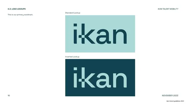
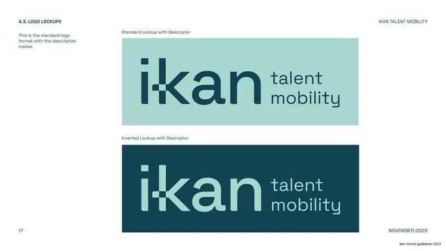
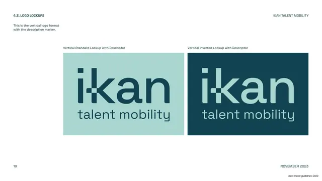
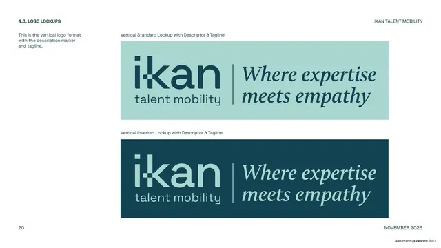
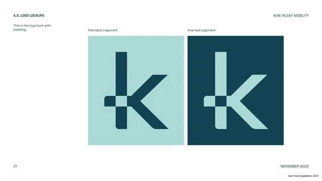
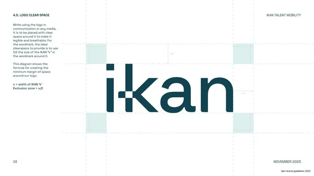
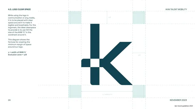
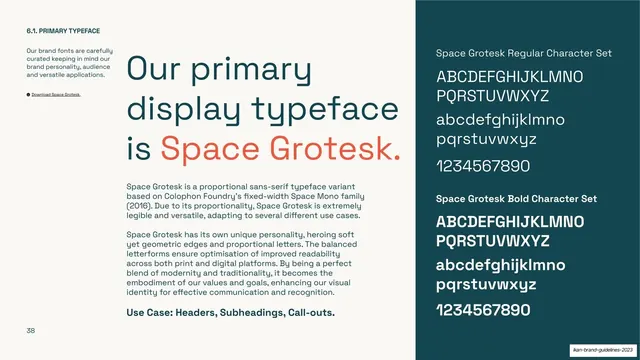
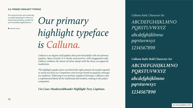
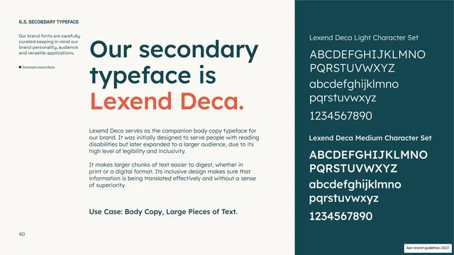
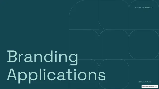
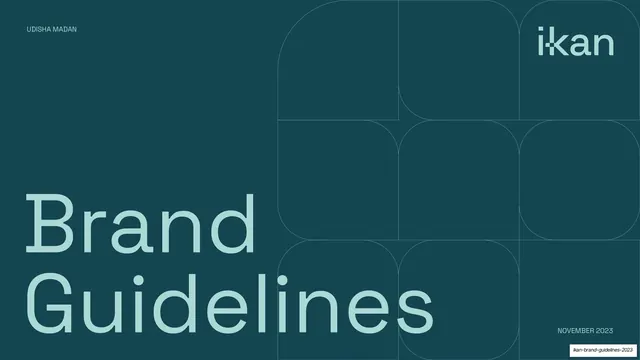
Slides run 16:9. The palette is locked to four values: midnight-green (#1A4A52), pale mint (#A9D5CE), warm cream (#F5F2EA), and a coral-orange accent (#E8613C). Two slide modes alternate. Dark mode covers and section dividers use a full-bleed midnight-green field with an oversized pale-mint title bleeding off the bottom and a faint 3x3 lattice of large rounded-square hairline outlines in the upper-right. Light mode content slides use a cream ground with a consistent running header (a small all-caps section label top-left, "IKAN TALENT MOBILITY" top-right) and footer (page number left, "NOVEMBER 2023" right). Type pairs a clean geometric grotesque (used for headlines and body, often set unusually large) with a serif italic in coral that lifts emphasis words inside running copy and labels the value cards. Recurring layouts: a two-column numbered contents; centered manifesto statements mixing teal grotesque and coral serif italic; long-copy narrative slides with italic highlights; tinted text panels paired with full-bleed aerial road photography; a row of capped value cards; a variable-width pill grid for brand vocabulary; and a logo chapter that shows the wordmark and "k" logomark with light construction guides, then a three-page positive/inverted lockup ladder that progressively adds a "talent mobility" descriptor and the serif-italic tagline "Where expertise meets empathy". The custom "i-kan" wordmark and its window-notched "k" logomark are the central brand devices.
Key takeaway
The two-tone discipline: an entire identity system carried on one dark and one light value, with cream as the neutral and a single coral accent reserved for emphasis. The reusable dark section-divider template (same field, same big title, same rounded-square lattice) that paces a long deck and makes every chapter break instantly legible. And the typographic emphasis grammar, lifting key phrases into a coral serif italic inside an otherwise neutral grotesque, applied consistently across manifesto, story, positioning, tone, and tagline slides.
Reuse notes
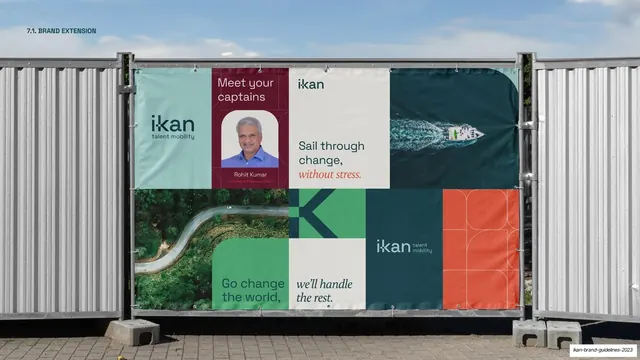
A strong reference for brand and identity guideline decks, and for any B2B or service company that wants to read calm, premium, and trustworthy without going cold. The lockup-ladder pattern (mark, mark+descriptor, mark+descriptor+tagline, each in positive and inverted swatches) is directly reusable for documenting a logo system. The aerial-road photography is the one element that needs sourcing; the rest of the system runs on type and two colors. The custom wordmark and the window-notched "k" are bespoke to IKAN; swap them for your own mark.
From this deck: IKAN Brand Guidelines 2023
View deck