Preview image. Unlock full-res
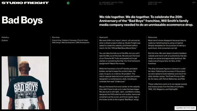
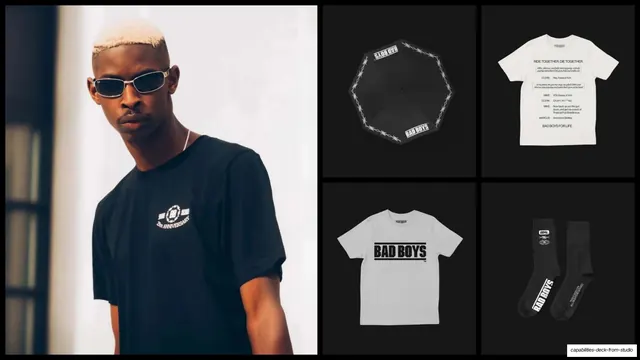
Bad Boys case-study opener with the franchise name set large, a bold "We ride together" statement, four labeled text columns, and a black tee portrait.
Summary
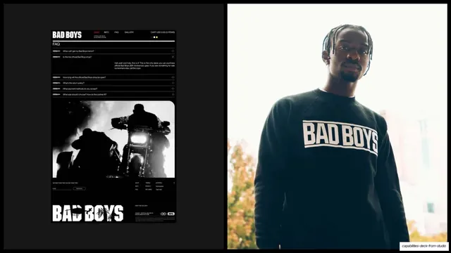
The Bad Boys case study opens with the franchise name oversized at top-left, a bold "We ride together. We die together." statement, four labeled text columns, and a portrait of a model in branded merch.
Visual description
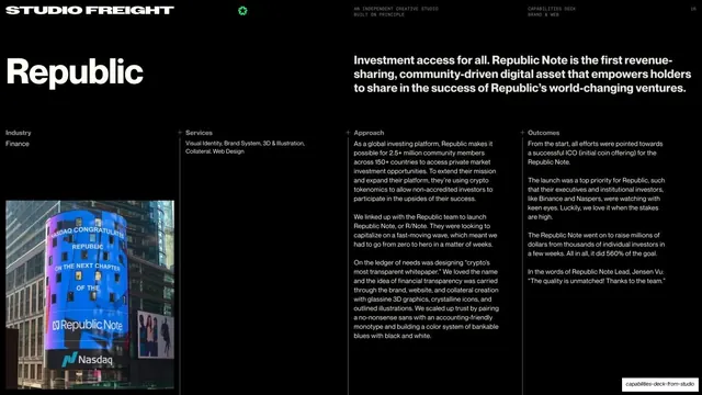
Black slide with the standard running header on a hairline rule ("STUDIO FREIGHT" left, green burst glyph centered, utility labels right, "2023" far right). "Bad Boys" sits oversized in bold near-white sans at top-left. To its right, the positioning line "We ride together. We die together. To celebrate the 25th Anniversary..." runs in the same weight. Below, four plus-marked columns headed "Industry" (Culture), "Services", "Approach", and "Outcomes" carry dense body copy in the franchise's voice. Anchored lower-left is a photo of a model from behind in a black "Bad Boys 25th Anniversary" tee. Pure monochrome, no accent color this time.
Key takeaway
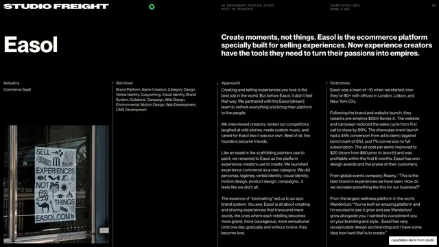
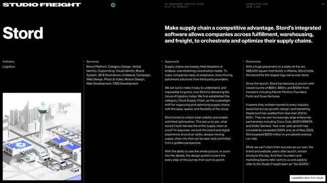
The identical case-study scaffold as the Stord intro (brand name, one bold claim, four fixed columns, one hero photo) reused for a wildly different brand, proving the template is the constant while tone and imagery change. Dropping the accent color and going pure black-and-white instantly re-skins the same layout for a streetwear client.
Reuse notes
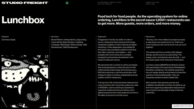
Confirms the four-column case-study grammar is brand-agnostic. Swap the render for a lifestyle photo and drop the accent color to shift from B2B software to culture merch using the same grid. Body copy stays dense, so it needs voice and substance to carry.
From this deck: Bad Boys case-study intro (We ride together)
View deck

More like this





Keep what you find
A free account saves references to boards and can send you a weekly email of picks based on what you save.
To see every result, go Pro.