Preview image. Unlock full-res
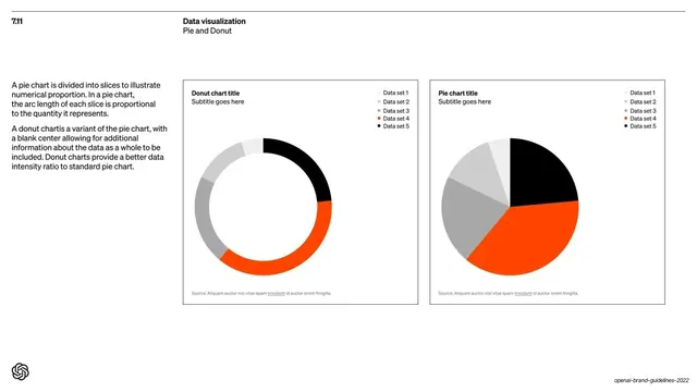
Data-viz page showing a donut chart and a pie chart side by side using the brand's greyscale-plus-orange-plus-black data sequence.
Summary
The "7.11 Data visualization / Pie and Donut" page: a donut chart and a pie chart side by side, demonstrating circular charts in the brand's greyscale-plus-orange-plus-black data sequence.
Visual description
White background with the "7.11 / Data visualization / Pie and Donut" header and a short left-column note explaining pie versus donut charts. Two thin-outlined panels fill the right two-thirds. The left is a "Donut chart title" ring; the right is a "Pie chart title" disc. Both are segmented with the same five-step sequence, light and mid greys plus orange and black, keyed to a "Data set 1-5" legend top-right, with a small source line at the bottom. The orange and black segments dominate each circle.
Key takeaway
Extending the same five-step branded data sequence (greys plus one accent plus black) from bar and column charts to circular charts, so every chart type shares one color language. Pairing donut and pie as a matched set documents both variants in one frame.
Reuse notes
Completes the data-viz chart set with circular charts. Reuse the consistent five-color data sequence across all chart types to keep a reporting system coherent. Note that here the accent reads orange while the bar/column page used blue; align on one accent if cross-chart consistency matters in your own system.
From this deck: Data visualization pie and donut charts
View deck








More like this








Keep what you find
A free account saves references to boards and can send you a weekly email of picks based on what you save.
To see every result, go Pro.