Preview image. Unlock full-res
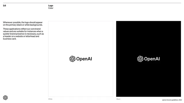
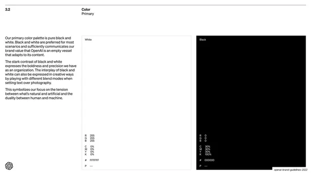
Logo-usage page showing the OpenAI lockup on a white panel and a black panel side by side, with explanatory copy in a left column.
Summary
The "2.6 Logo / Color" page: the OpenAI horizontal lockup shown centered on a white panel and on a black panel, side by side, with usage notes in a narrow left text column.
Visual description
White background with the "2.6 / Logo / Color" header. A narrow left column holds two short paragraphs of black Söhne sans explaining that the logo should appear on primary black or white backgrounds. The right two-thirds is split into two equal square panels: a white panel (thin grey outline) with the dark "OpenAI" knot-plus-wordmark lockup centered, and an adjacent black panel with the same lockup reversed to white. Tiny "White" and "Black" captions sit under each panel. The black knot mark anchors the bottom-left.
Key takeaway
Presenting a logo on its two primary grounds as matched square panels side by side, so correct usage is shown rather than described. The narrow-text-column / wide-example-panels split is the deck's reusable do-this layout.
Reuse notes
A standard, dependable layout for any logo-usage, do/don't or specimen page. The paired light/dark panels read instantly. Reuse the left-column-explanation plus right-column-examples grid across logo, color and imagery guideline pages for consistency.
From this deck: Logo color on black and white
View deck



More like this








Keep what you find
A free account saves references to boards and can send you a weekly email of picks based on what you save.
To see every result, go Pro.