Preview image. Unlock full-res
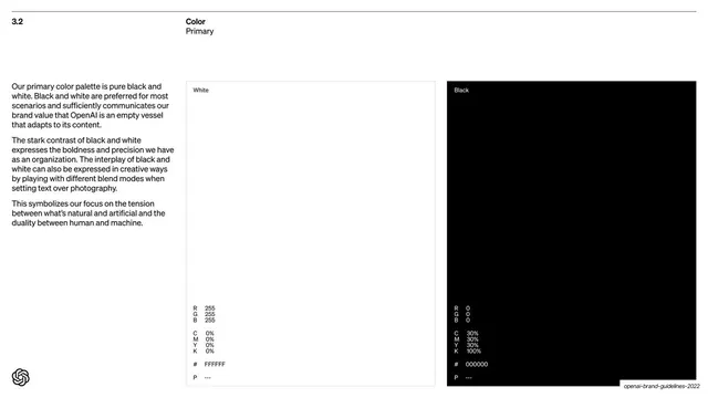
Primary-color page showing a white and a black swatch panel side by side, each with full RGB, CMYK, hex and Pantone specs.
Summary
The "3.2 Color / Primary" page: white and black presented as two large swatch panels side by side, each annotated with full RGB, CMYK, hex and Pantone values, with rationale in a left text column.
Visual description
White background with the "3.2 / Color / Primary" header. A narrow left column holds three short paragraphs of black Söhne sans explaining that black and white are the preferred primary colors. The right two-thirds is two tall panels: a white panel (thin grey outline) and a black panel. Each panel carries a small "White" / "Black" label at top and, at the bottom, a column of color specs set in small Söhne Mono: R/G/B, then C/M/Y/K, then "#" hex (FFFFFF / 000000), then "P" Pantone (dashes).
Key takeaway
Treating black and white as real, fully-specified palette colors, complete with RGB, CMYK, hex and Pantone, rather than defaults. Setting the specs in a monospace face makes the data feel precise and engineered. The big-panel-plus-spec-block is a clean swatch template.
Reuse notes
A model swatch page for any palette guideline. The mono spec stack under each panel is directly reusable for every color in a system. Pairs with the explanatory left column used throughout the deck. Good when you want the palette page to read as technical documentation, not decoration.
From this deck: Primary color palette black and white
View deck









More like this









Keep what you find
A free account saves references to boards and can send you a weekly email of picks based on what you save.
To see every result, go Pro.