Preview image. Unlock full-res
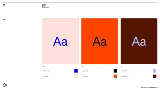
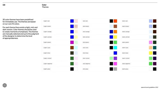
Detail page for the Red theme showing light, mid and dark variants as three large "Aa" panels with their two-color token pairs below.
Summary
A per-theme detail page for "Red": three large square panels (Light, Mid, Dark) each showing an "Aa" specimen in the theme's text color, with the two underlying color tokens listed below each panel.
Visual description
White background with the "3.8 / Color / Themes" header and a small "Red" label in the left column. Three big square panels run across: a pale pink panel with a blue "Aa", a bright orange panel with a black "Aa", and a dark maroon panel with a pale-blue "Aa". Tiny "Light", "Mid", "Dark" captions sit under each. Below each panel, two small token rows in Söhne Mono name the colors with their own mini-swatches: e.g. "blue-600" + "red-200", "gray-900" + "red-700", "blue-300" + "red-900".
Key takeaway
Showing each theme as a real "Aa" specimen so the text/background contrast is judged in context, not abstractly. Listing the exact named tokens that compose each variant ties the visual directly to the system's color tokens. The light/mid/dark triptych makes one theme's range readable in a glance.
Reuse notes
A strong per-theme detail template to follow an overview grid. Reuse the "Aa-on-background plus token list" panel for any color, type or contrast specimen. The named tokens double as implementation spec; keep them identical to your code variables.
From this deck: Red theme light mid dark
View deck

More like this
Keep what you find
A free account saves references to boards and can send you a weekly email of picks based on what you save.
To see every result, go Pro.