Preview image. Unlock full-res
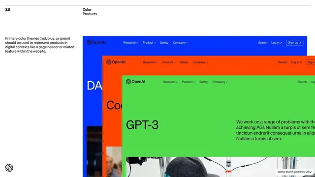
Application page showing three stacked, overlapping product webpage mockups in blue, orange and green to demonstrate primary color themes in product UI.
Summary
The "3.8 Color / Products" page: three OpenAI webpage mockups in blue, orange and green, stacked and overlapping diagonally to show primary color themes applied to product headers.
Visual description
White background with the "3.8 / Color / Products" header and a short left-column note that primary color themes (red, blue or green) should represent products in digital contexts. The right side shows three full-width website mockups overlapping like a fanned stack from top-left to bottom-right: a blue page, an orange page reading "Cod..."/"DA...", and a green page foregrounded showing a "GPT-3" header with an OpenAI nav (Research, Product, Safety, Company, Search, Log in, Sign up) and body copy, plus a photo bleeding in at the bottom. Each mockup carries the same nav lockup recolored to its theme.
Key takeaway
Demonstrating color themes on real product chrome, the same site header recolored per theme, instead of abstract swatches. The overlapping, fanned-stack arrangement shows three applications in one frame and implies a switchable system. Keeping the layout fixed while only the color changes proves the theme system works.
Reuse notes
Use to show a color or theming system in live UI context on a guideline page. The recolored-header trick communicates "same product, different theme" instantly. Needs realistic product mockups; the overlapping stack reads best when each layer is clearly the same layout in a different hue.
From this deck: Primary color themes for products
View deck

More like this

Keep what you find
A free account saves references to boards and can send you a weekly email of picks based on what you save.
To see every result, go Pro.