Preview image. Unlock full-res
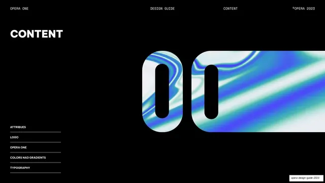
Table-of-contents page with a "CONTENT" heading, a left-column section list on hairline rules, and a large gradient-filled Opera "00" on the right.
Summary
The contents page: a left-aligned list of the guide's five sections set against a large gradient-filled pair of Opera "O" shapes on the right.
Visual description
Pure-black background with the monospace header (OPERA ONE / DESIGN GUIDE / CONTENT / ©OPERA 2023). A "CONTENT" heading sits upper-left in white all-caps. The lower-left holds a vertical list of sections, each on its own hairline rule: ATTRIBUTES, LOGO, OPERA ONE, COLORS NAD GRADIENTS (sic), TYPOGRAPHY. The right half is dominated by two side-by-side rounded-capsule Opera "O" shapes clipped over a blue-cyan iridescent fluid gradient.
Key takeaway
Treating the contents list as quiet utility type in the corner while the gradient-clipped monogram carries the page visually. The hairline rule under each list item gives a tidy, technical index feel.
Reuse notes
A reusable contents layout for guideline decks. The list-left, image-right split scales to any number of sections. Note the visible typo "NAD" in the source; reproduce or correct per intent.
From this deck: Content index
View deck



More like this








Keep what you find
A free account saves references to boards and can send you a weekly email of picks based on what you save.
To see every result, go Pro.