Preview image. Unlock full-res
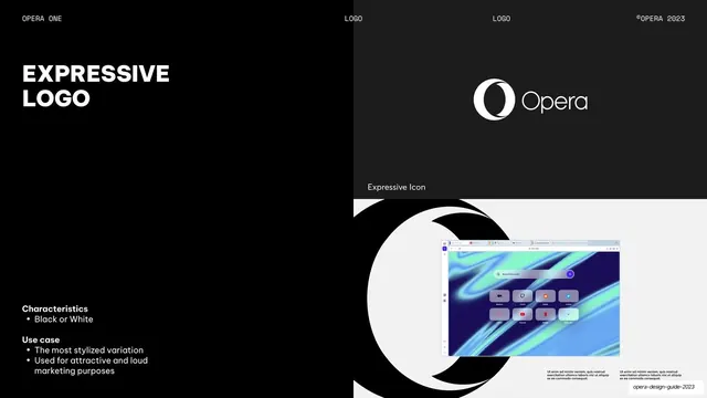
Split page detailing the black-or-white Expressive icon, with text left and a large cropped "O" framing a start-page mockup on the right.
Summary
A logo-usage page for the Expressive icon, the stylized black-or-white Opera "O", shown large with a product mockup nested inside it.
Visual description
The left half is pure-black with an oversized two-line "EXPRESSIVE LOGO" all-caps headline and low-left "Characteristics" (Black or White) and "Use case" notes. The right half is a charcoal panel: the white Opera logo with an "Expressive Icon" label at top, and below a light-grey area where a huge black Opera "O" is cropped at the bottom edge, with a small Opera start-page browser screenshot overlapping its lower-left and two columns of placeholder body text beneath. Monospace header reads LOGO / LOGO.
Key takeaway
Blowing the expressive mark up to poster scale and letting a small product screenshot overlap it, contrasting the stylized brand shape against real UI. The light panel gives the otherwise dark section a deliberate tonal break.
Reuse notes
A reusable layout for a hero or marketing logo treatment. The oversized-mark-plus-nested-screenshot composition reads well at large sizes; keep the supporting text minimal so the mark stays dominant.
From this deck: Expressive logo
View deck



More like this






Keep what you find
A free account saves references to boards and can send you a weekly email of picks based on what you save.
To see every result, go Pro.