Preview image. Unlock full-res
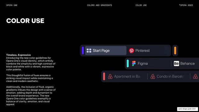
Color-use page explaining the black/white-plus-expressive strategy, with body copy left and colored tab UI chips on the right.
Summary
A color-use page describing how black and white combine with a vibrant expressive palette and fluid gradients, illustrated by colored UI chips.
Visual description
The left third is pure-black with a "COLOR USE" headline and three short paragraphs under a bold "Timeless, Expressive" lead, explaining the fusion of high-contrast black/white with a vibrant palette and organic gradients. The right two-thirds show stacked dark UI cards (tab islands) each with a colored left accent bar: a violet "Start Page" / "Pinterest" pill group with an orange chip, a teal Figma / Behance row, and a coral Airbnb listing row. Monospace header reads COLORS AND GRADIENTS / COLOR USE.
Key takeaway
Demonstrating the color strategy through the actual product's accent system rather than abstract swatches, so each color is shown doing a real job (a tab-island accent bar) instead of floating as a sample.
Reuse notes
A reusable way to explain accent-color usage: pair the written strategy with live UI components tinted in the palette. Stronger than a bare swatch row because it shows context and restraint.
From this deck: Color use strategy
View deck



More like this








Keep what you find
A free account saves references to boards and can send you a weekly email of picks based on what you save.
To see every result, go Pro.