Preview image. Unlock full-res
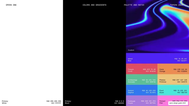
Named color palette with RGB/HEX values, split across white, black, a gradient swatch, and a grid of expressive accent colors sized by ratio.
Summary
The core palette page: white and black primaries on the left, a gradient and a named expressive-color grid on the right, each swatch carrying its RGB and HEX values and sized to suggest usage ratio.
Visual description
The page is split into three full-height columns. Left: a white field labeled "Primary White, RGB 255 255 255, HEX FFFFFF". Center: a black field labeled "Primary Black, RGB 0 0 0, HEX 000000". Right: a tall blue-orange iridescent gradient swatch labeled "Gradient" over a stacked grid of named accent swatches with RGB/HEX values, including Island Blue (#4E23F7), Canyon Coral (#DF4E60), Oasis Orange (#EC8D54), Archipelago Avocado (#5EBF98), Plateau Primrose (#EDC57D), Summit Saphire (#3178F0), Fjord Azure (#4BE7DD), Peninsula Purple (#A879DA), Parasol Pink (#FE79DE). Monospace header reads COLORS AND GRADIENTS / PALETTE AND RATIO. The swatch sizes encode relative usage, with the large white/black primaries dominating.
Key takeaway
Encoding usage ratio into swatch size: the huge white and black primaries plus a smaller expressive grid show at a glance that the system is mostly monochrome with accents used sparingly. Giving every accent a poetic place-name plus exact RGB/HEX makes the palette both memorable and precise.
Reuse notes
A directly reusable palette spec. The ratio-by-area idea communicates a color strategy faster than any rule text. Names like "Canyon Coral" aid recall but pair them with hard values, as here, for build accuracy.
From this deck: Palette and ratio
View deck






More like this






Keep what you find
A free account saves references to boards and can send you a weekly email of picks based on what you save.
To see every result, go Pro.