Preview image. Unlock full-res
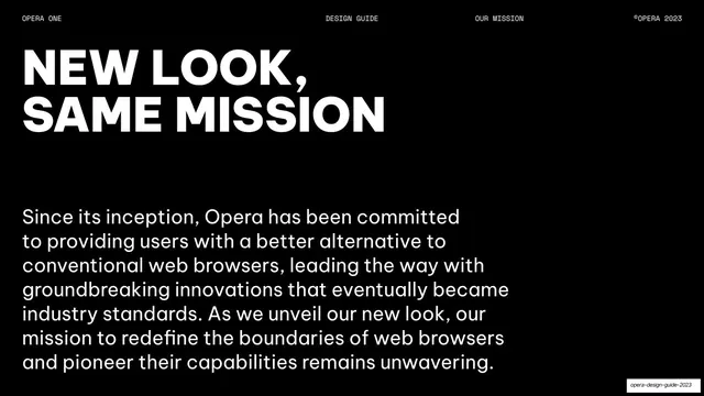
Black mission page with a two-line oversized all-caps "NEW LOOK, SAME MISSION" headline above a paragraph of body copy.
Summary
A mission statement page restating Opera's purpose under the new identity, led by an oversized two-line headline.
Visual description
Pure-black background, monospace header (OPERA ONE / DESIGN GUIDE / OUR MISSION / ©OPERA 2023) on a hairline rule. An oversized two-line all-caps headline, "NEW LOOK, / SAME MISSION", fills the upper-left in white Be Vietnam Pro black weight. Below it, a multi-line paragraph of white sans-serif body copy describes Opera's history of innovation and its continuing mission to redefine web browsers. The right side is empty black.
Key takeaway
The repeated divider grammar of a huge all-caps headline over a single justified-feeling paragraph, with the right half left blank for rhythm across the deck.
Reuse notes
A reusable mission or about layout for guideline and corporate decks. Identical structure to the other statement pages here, which is the point: consistency over novelty.
From this deck: New Look, Same Mission
View deck



More like this



Keep what you find
A free account saves references to boards and can send you a weekly email of picks based on what you save.
To see every result, go Pro.