
Preview image. Unlock full-res
Clear-space and minimum-size page with text rules left and three measurement diagrams of the logo on X/Y grids right.
Summary
A clear-space and minimum-size page setting exclusion-zone rules around the logo, with three labeled measurement diagrams.
Visual description
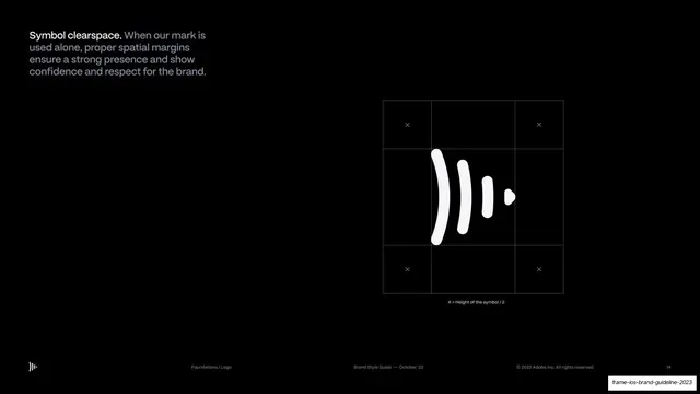
The left third is pure-black with a two-line "CLEAR SPACE" headline and several short paragraphs: the logo's two elements, minimum sizes (Digital 25px, Print 1cm), and clear-space rules expressed as X = 50% icon height and Y = 25% icon height. The right two-thirds show three diagrams on faint grids: the icon alone with X/Y exclusion markers, the stacked icon-plus-"Opera" lockup with corner Y markers, and the horizontal icon-plus-"Opera" lockup with X markers. Monospace header reads LOGO / CLEAR SPACE.
Key takeaway
The standard clear-space treatment done well: each lockup variant gets its own gridded diagram with X/Y units keyed to icon height, so the rule is unambiguous and proportional rather than fixed.
Reuse notes
A directly reusable clear-space and minimum-size spread for any brand guideline. Expressing spacing as a fraction of the mark (X/Y units) is the convention to copy. Keep the grid faint so the mark stays legible.
From this deck: Logo clear space and minimum size
View deck

























More like this







Keep what you find
A free account saves references to boards and can send you a weekly email of picks based on what you save.
To see every result, go Pro.