Preview image. Unlock full-res
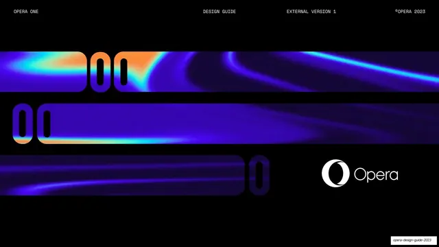
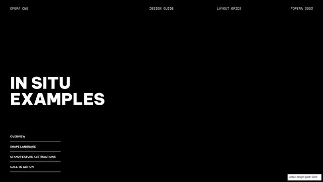
Black cover with horizontal Opera "O" gradient bands and the Opera logo bottom-right under a monospace running header.
Summary
The title page: a black field crossed by horizontal Opera "O"-shaped gradient bands, with the Opera wordmark anchored bottom-right.
Visual description
Pure-black background. The monospace running header sits on a hairline rule across the top: "OPERA ONE" left, "DESIGN GUIDE" center, "EXTERNAL VERSION 1", and "©OPERA 2023" right. The middle of the page is filled with three stacked horizontal bands clipped into the rounded-capsule silhouette of the Opera "O", revealing iridescent blue-to-orange fluid gradients inside the letterforms. The white Opera logo (the "O" icon plus "Opera" logotype) sits in the lower-right.
Key takeaway
Using the brand letterform itself as a clipping mask for gradient artwork, so the cover reads as both type and image. Pinning the actual logo small in a corner while the cropped mark does the dramatic work above it.
Reuse notes
A confident cover pattern for a brand or product guideline built on a distinctive monogram. Depends on good gradient artwork inside the mask; the horizontal-band crop only works with a strong, recognizable letterform.
From this deck: Opera One design guide cover
View deck



More like this





Keep what you find
A free account saves references to boards and can send you a weekly email of picks based on what you save.
To see every result, go Pro.