Preview image. Unlock full-res
A split slide with a warm lifestyle photo on the left and four bold revenue, margin, and EBITDA highlight bullets on the right.
Summary
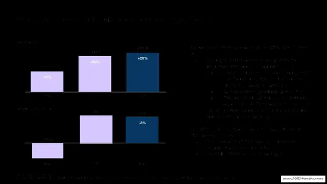
The quarter at a glance: a left-hand lifestyle photo paired with four right-hand bullets calling out record revenue, gross margin, adjusted EBITDA, and EBITDA margin.
Visual description
Soft lavender background. "Q2 Highlights" sits top-left in a large black grotesque sans. Below it, a warm lifestyle photograph fills the lower-left: a woman and a small child sitting on a wood floor by a glass door putting on rain boots, with a black Sonos speaker on a side table. The right column holds four dot-bulleted highlights, each leading with a bold figure and dropping to lighter sub-copy: "Record Q2 revenue of $399.8M, +20% from LY...", "Q2 gross margin of 44.8%, -300 bps from Q1...", "Q2 adjusted EBITDA of $46.9M, -3% from LY...", and "Q2 adjusted EBITDA margin of 11.7%". A small footnote about unaudited non-GAAP measures sits bottom-right.
Key takeaway
Leading each bullet with the bold number and demoting the explanation to lighter text makes a metrics list scannable in seconds. Pairing the data column with a warm human photo keeps an earnings highlight slide from feeling cold.
Reuse notes
A reliable "quarter highlights" layout for any earnings or board deck: image left, bold-number bullets right. Works with any brand color field. Keep it to four bullets so the photo can hold half the slide.