Preview image. Unlock full-res
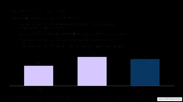
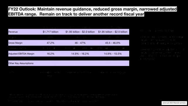
A dark slide explaining gross-margin pressure from supply-chain costs above a three-bar chart in lavender and navy.
Summary
A margin slide: a short headline and bullet list across the top explaining gross-margin pressure, with a three-bar chart spanning the lower half.
Visual description
Near-black full-bleed background. A headline and four short bullet lines sit in the upper third (explaining gross-margin decline, component and shipping cost increases, foreign-exchange and tariff effects). The lower half holds a single bar chart: three tall bars on a thin baseline, the first two pale lavender and the third deep navy, each topped with a small value label. The layout puts narrative on top and a single supporting chart beneath. Text and labels are very low-contrast on the black ground.
Key takeaway
Putting the explanation above and one clean chart below makes a "why margin moved" slide read top-to-bottom as a single thought. Reusing the lavender-then-navy bar sequence keeps the current period as the visual emphasis across the whole deck.
Reuse notes
A clear template for explaining a single moving metric: reasons on top, one chart below. The dark background severely limits legibility here. Flagged needs_review: the capture is very dark and the bullet text and bar values are largely unreadable.
From this deck: Increased supply chain costs
View deck








More like this




Keep what you find
A free account saves references to boards and can send you a weekly email of picks based on what you save.
To see every result, go Pro.