Preview image. Unlock full-res
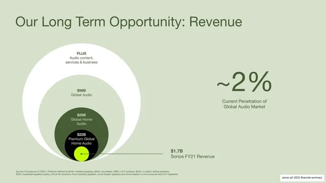
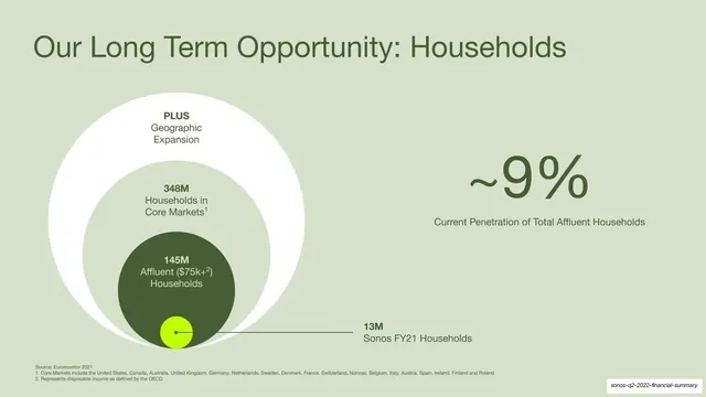
A pale-green slide mirroring the households diagram to size the revenue opportunity, with a tiny lime dot for Sonos FY21 revenue and a large ~2% penetration figure at right.
Summary
The revenue counterpart to the previous slide: the same nested-circle diagram sizing the revenue opportunity from global audio down to Sonos FY21 revenue, with a large "~2%" penetration figure at right.
Visual description
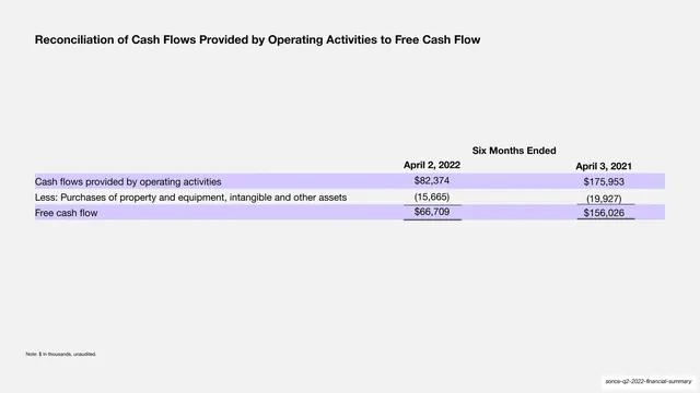
Pale sage-green full-bleed background. "Our Long Term Opportunity: Revenue" sits top-left in dark-green sans. The left half repeats the nested-circle diagram structure: a white outer ring "PLUS Audio content, services & business", an inner ring "$96B Global Audio", a dark-green circle "$29B Global Home Audio", a near-black inner circle "$22B Premium Global Home Audio", and a tiny lime-green dot at the bottom connected by a leader line to "$1.7B Sonos FY21 Revenue". On the right, an oversized dark-green "~2%" sits above "Current Penetration of Global Audio Market". Small source footnotes run along the bottom.
Key takeaway
Repeating the exact diagram grammar from the households slide for revenue creates a matched pair that reads as one argument across two slides. The added innermost near-black circle shows one more layer of market segmentation while keeping the lime "us" dot consistent.
Reuse notes
Pair this with the households version to tell a two-part TAM story (units and dollars) using one shared visual language. Reusing the same diagram twice is a deliberate strength here, not repetition. Keep label counts and dot placement consistent between the pair.
From this deck: Long Term Opportunity - Revenue
View deck





More like this




Keep what you find
A free account saves references to boards and can send you a weekly email of picks based on what you save.
To see every result, go Pro.