Preview image. Unlock full-res
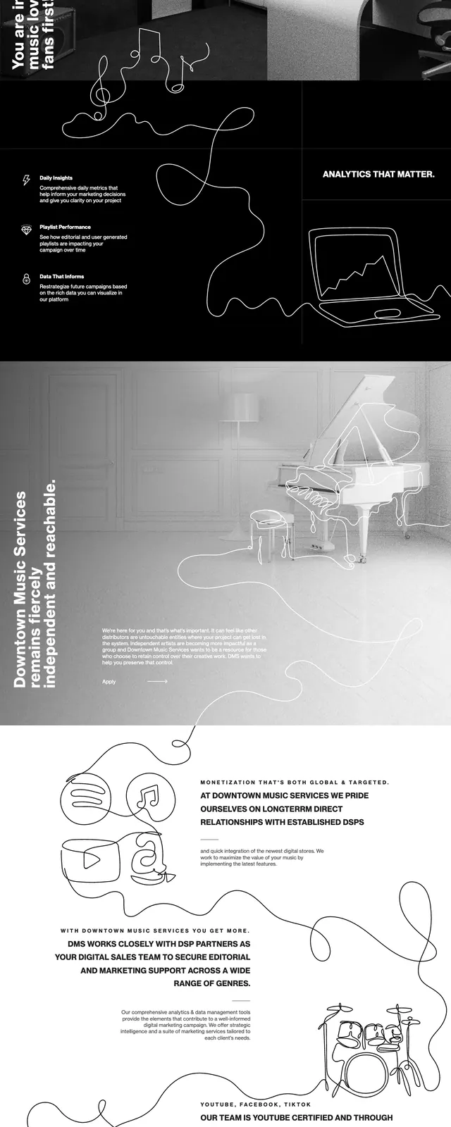
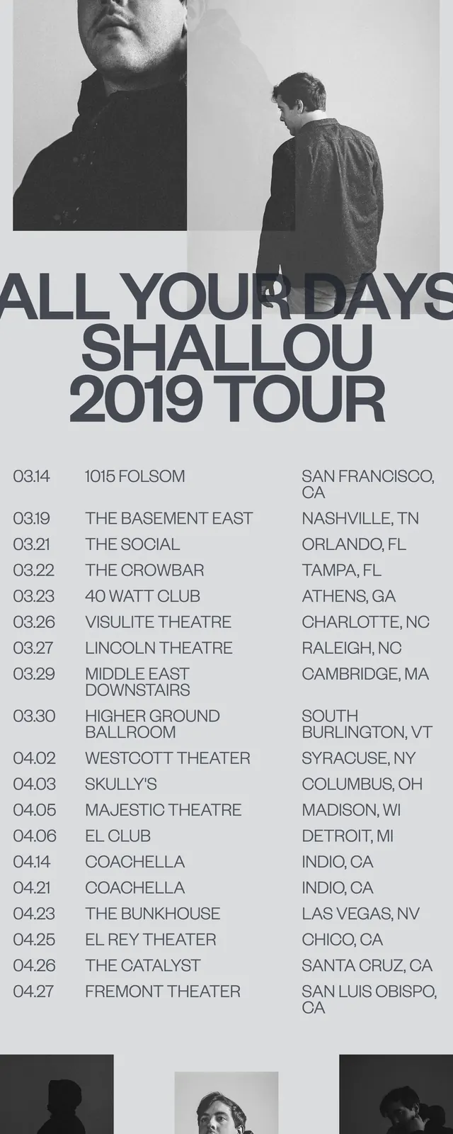
A stark, high-contrast promotional page for a music tour featuring bold typography and monochromatic photography.
Summary
A stark, high-contrast promotional page for a music tour featuring bold typography and monochromatic photography.
Visual description
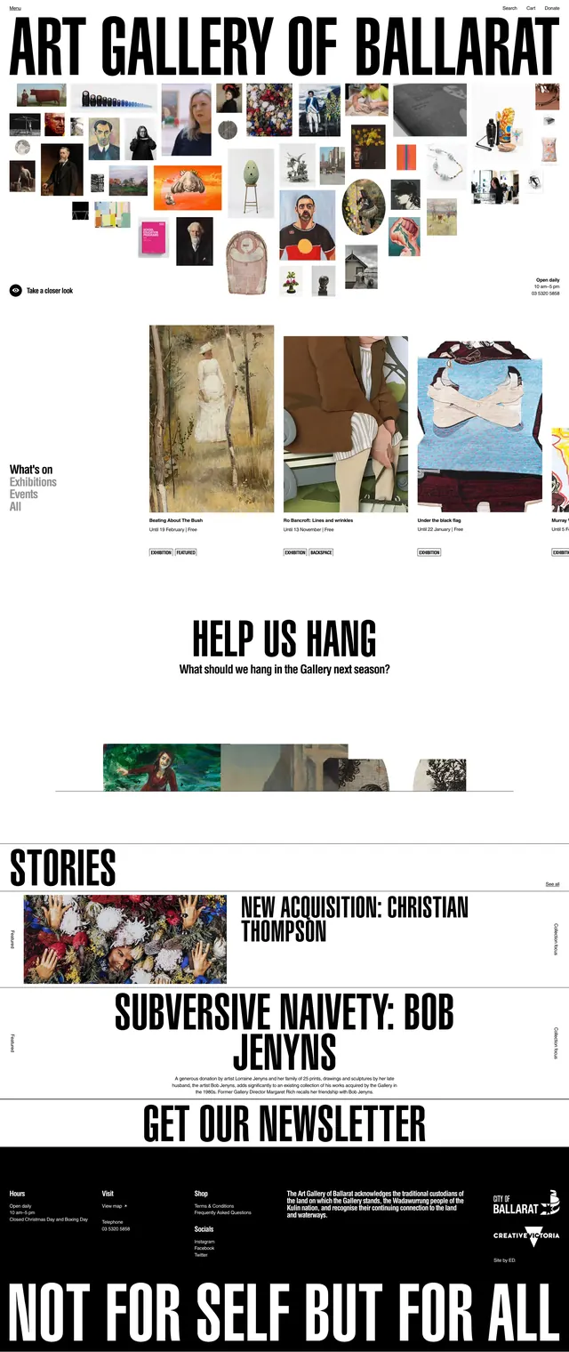
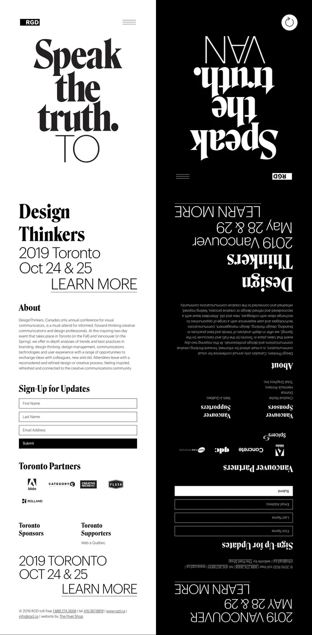
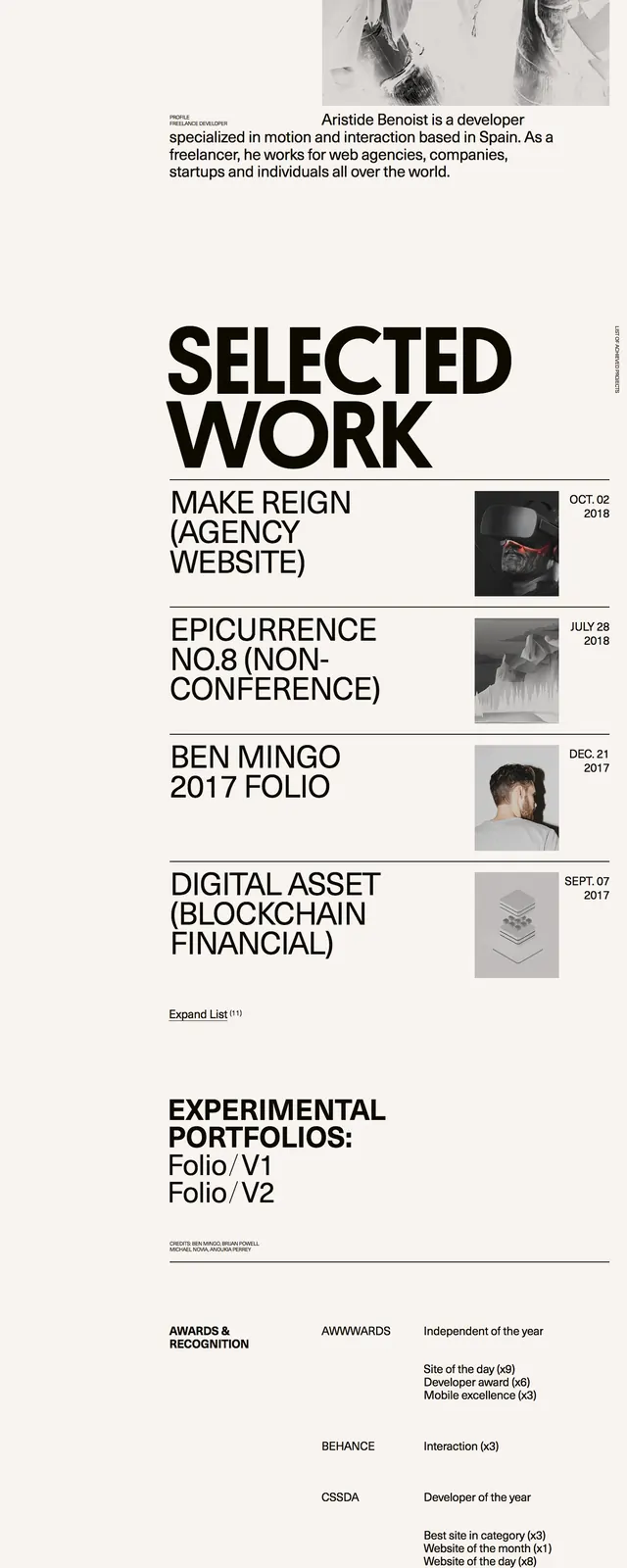
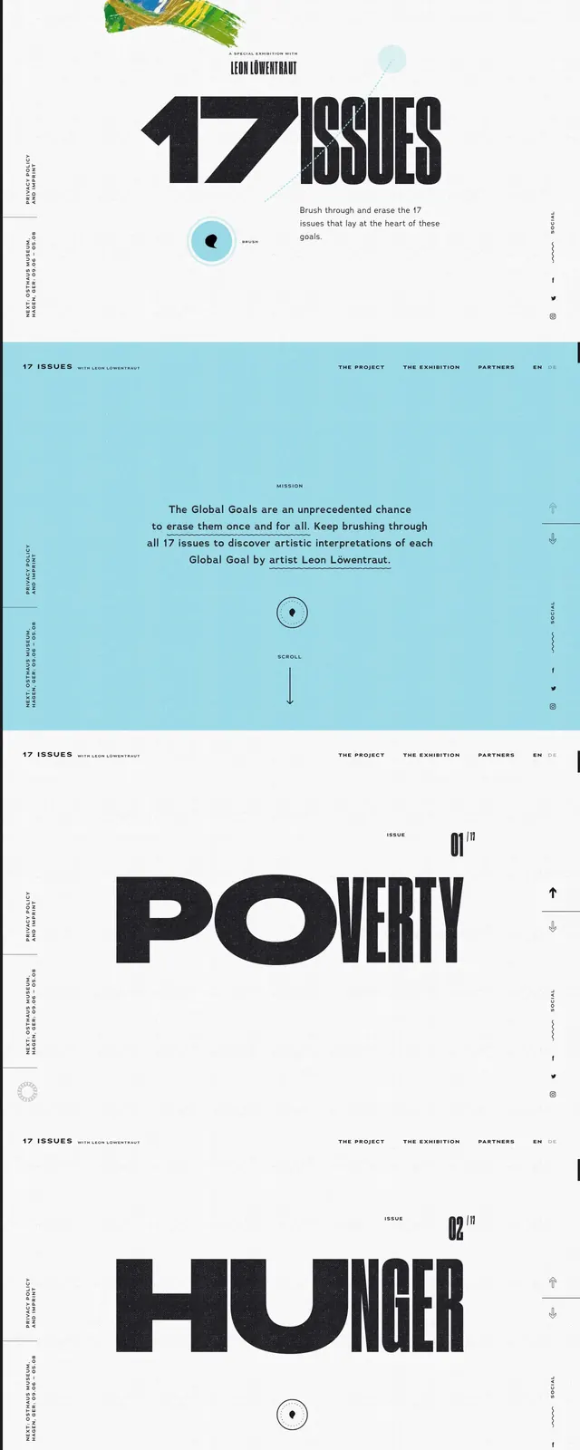
The page uses a strict black, white, and grey palette with massive, overlapping sans-serif headlines. High-contrast black and white portraits of the artist are integrated into the layout. The tour dates are presented in a clean, structured list format with ample whitespace.
Key takeaway
The use of oversized typography as a primary design element creates a strong visual hierarchy and a modern, editorial feel.
Reuse notes
Ideal for event promotion or artist portfolios where the brand identity relies on bold imagery and minimal color.