Preview image. Unlock full-res
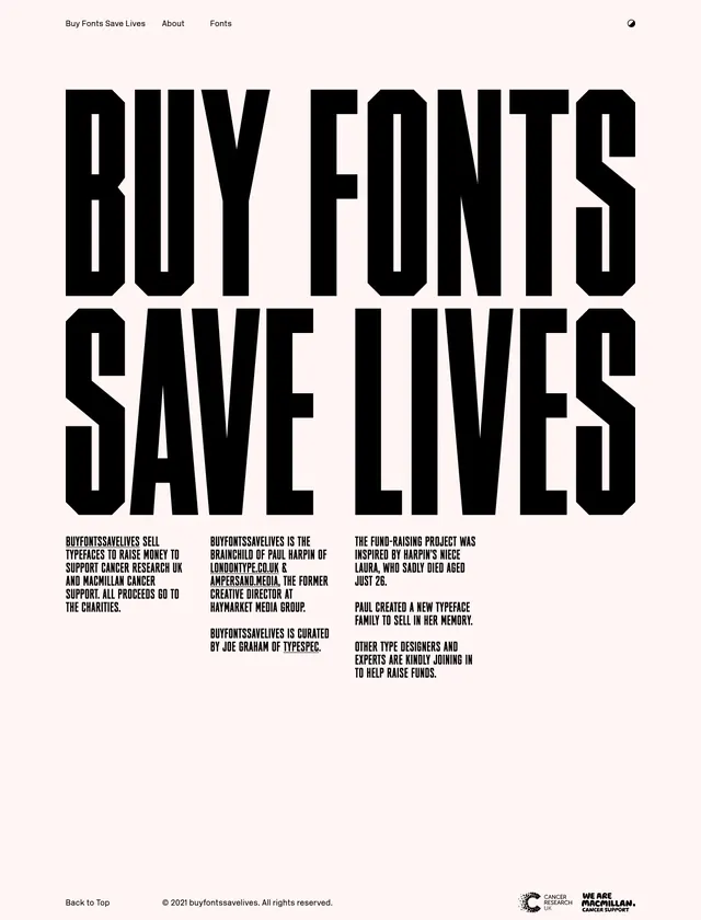
A stark, typography-led landing page for a charity typeface project with oversized black headline text on a pale pink background.
Summary
A stark, typography-led landing page for a charity typeface project with oversized black headline text on a pale pink background.
Visual description
The page uses a very large, condensed all-caps headline split across two lines reading "BUY FONTS / SAVE LIVES". The background is a soft pale pink, while the type is solid black with extremely tight spacing and heavy vertical forms. A minimal top navigation sits in the upper left, a small icon appears at the upper right, and three short text columns explain the project beneath the headline. Lower in the capture, the same oversized headline repeats in the next scroll section, with a sparse footer area and small charity logos at the bottom.
Key takeaway
The main effect comes from letting one statement dominate the page with almost no competing UI. The contrast between the gentle background and aggressive display type creates immediate attention and a clear fundraising tone.
Reuse notes
Use this pattern for campaign landing pages, charity microsites, or any message that benefits from a single uncompromising typographic hook. It works best when the surrounding content is intentionally sparse and the brand can afford a stark, poster-like presentation.