Preview image. Unlock full-res
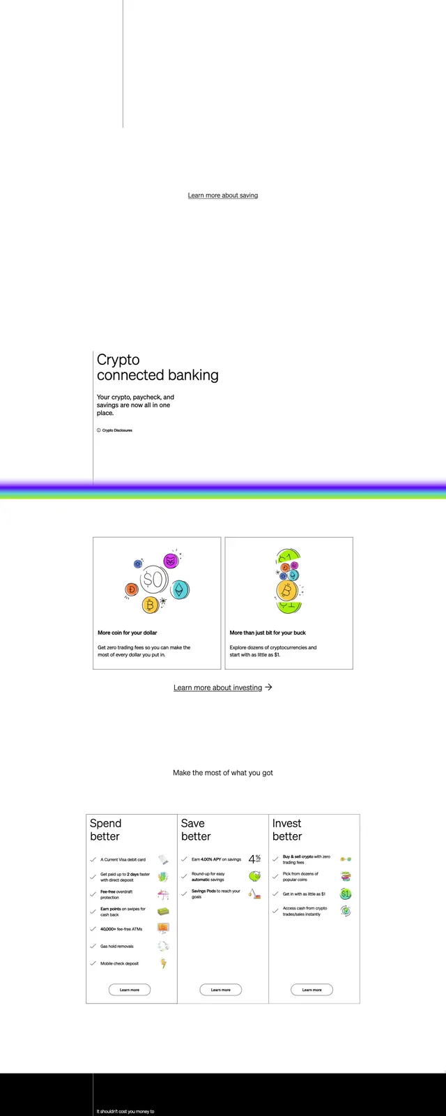
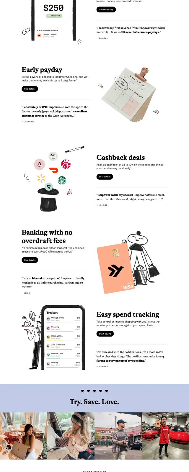
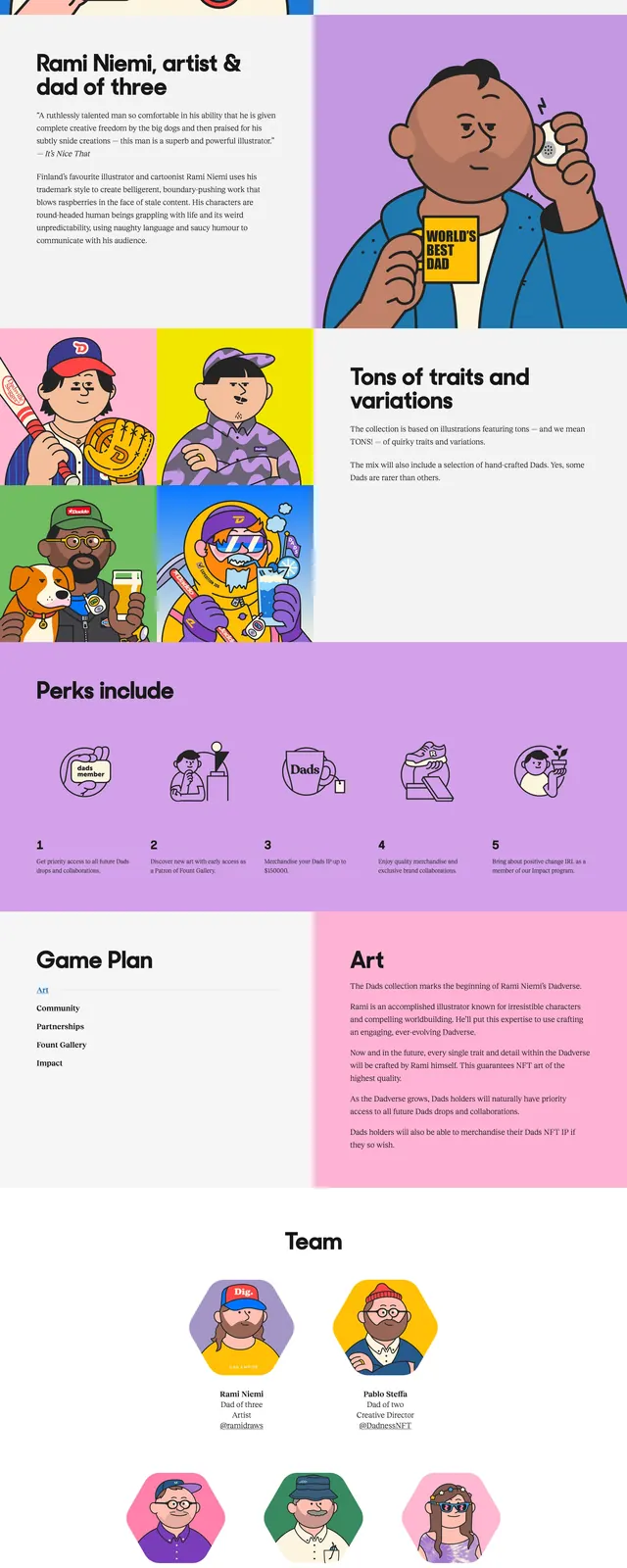
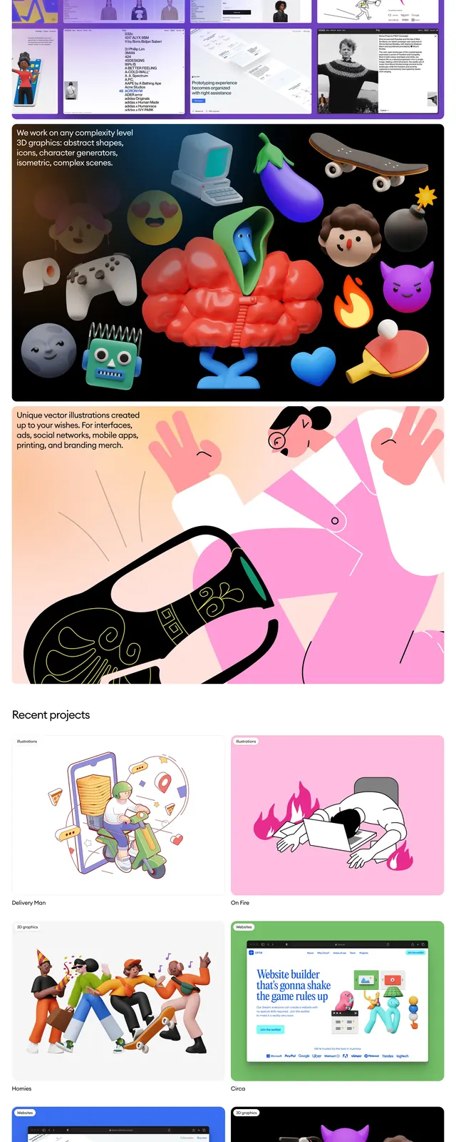
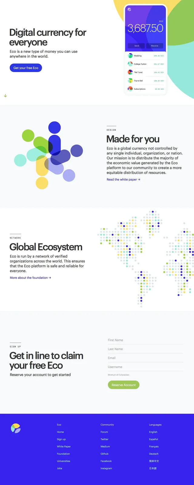
A bright, minimal fintech landing page for Eco with large editorial typography, rounded illustrations, and generous white space.
Summary
A bright, minimal fintech landing page for Eco with large editorial typography, rounded illustrations, and generous white space.
Visual description
The page uses a wide, white hero layout with a left-aligned headline, supporting copy, and a prominent rounded call-to-action button. On the right, a phone mockup is paired with large overlapping circular color fields in yellow, green, and aqua. Lower sections continue the clean editorial structure with split text-and-illustration blocks, a dotted world map graphic, and a simple signup form above a solid blue footer.
Key takeaway
The design combines startup simplicity with playful geometric illustration to make a financial product feel approachable and global. Strong whitespace, oversized headings, and bright accent colors create clear hierarchy without visual clutter.
Reuse notes
This pattern works well for consumer fintech or crypto brands that want to communicate trust while still feeling modern and friendly. The split hero plus illustrated feature sections are easy to reuse for product storytelling, mission messaging, and account signup flows.