Preview image. Unlock full-res
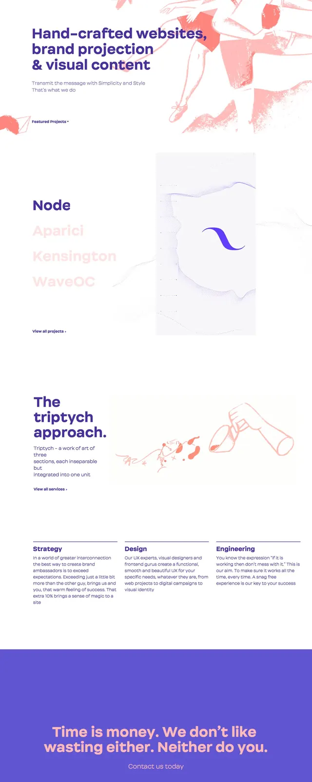
A minimalist, art-directed agency landing page with a bright white canvas, bold purple typography, and soft coral illustration accents.
Summary
A minimalist, art-directed agency landing page with a bright white canvas, bold purple typography, and soft coral illustration accents.
Visual description
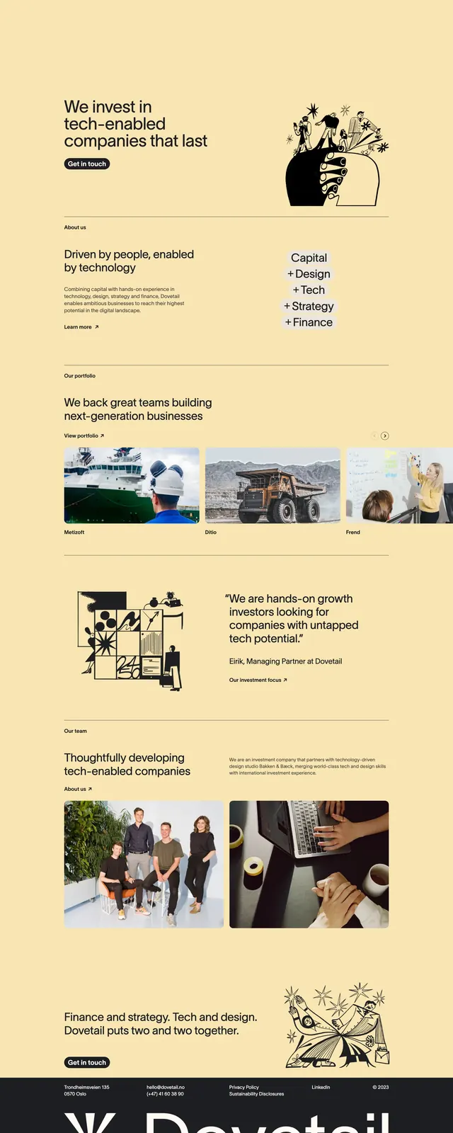
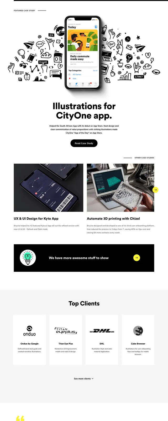
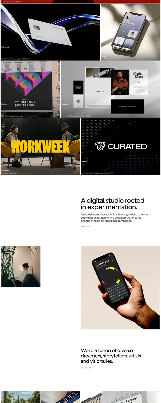
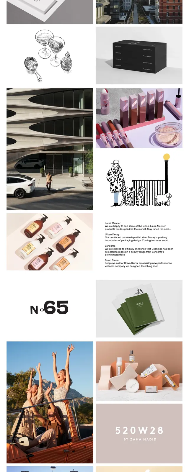
The page opens with a clean white hero section, a small top navigation, and a large bold headline aligned left. Loose coral-pink hand-drawn illustrations and paint-like textures occupy the right side and upper background, creating a handcrafted feel. Below the hero, faint project previews and section labels appear before a full-width purple call-to-action block with centered contact text and email. The overall composition uses generous whitespace, soft contrast, and sparse content to keep attention on the typography and artwork.
Key takeaway
The design pairs editorial restraint with expressive illustration, making the brand feel creative but controlled. It is a strong pattern for agencies that want a handcrafted identity without visual clutter.
Reuse notes
Reuse the layout for portfolio or agency homepages that need a premium, artsy tone. Keep the structure simple: one dominant headline, one supporting line, a primary CTA, and a single illustrated visual anchor.