Preview image. Unlock full-res
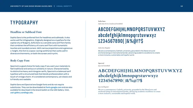
The two brand typefaces shown as full character-set specimens, Sophia Sans for headlines and Spectral for body, with usage notes.
Summary
The typography page, presenting the two brand fonts, Sophia Sans (headlines and infographics) and Spectral (body), as full character-set specimens with weight names and a sample paragraph each.
Visual description
Left column: "TYPOGRAPHY" in tracked condensed Founders Blue caps, a "Headline or Subhead Font" Spectral subhead with a paragraph on Sophia Sans (a condensed humanist sans originally designed for Sofia, Bulgaria), then a "Body Copy Font" subhead with a paragraph on Spectral and a note that both are free Google fonts. The right column shows two specimens: "Sofia Sans Extra Condensed SemiBold" displayed as a full uppercase, lowercase and numeral set in Founders Blue, followed by a small "Sofia Sans Regular" sample sentence; then "Spectral SemiBold" as a full serif character set, followed by a "Spectral Regular" sample sentence. (The text labels the headline face "Sofia Sans"; the body refers to it as "Sophia Sans.")
Key takeaway
A two-typeface system, a tightly condensed sans for impact headers paired with a triangular-serif for warm, readable body, is a versatile, low-cost pairing, made more practical by both being free Google fonts. Full character-set specimens plus a sample paragraph per face is the right level of detail for a type page.
Reuse notes
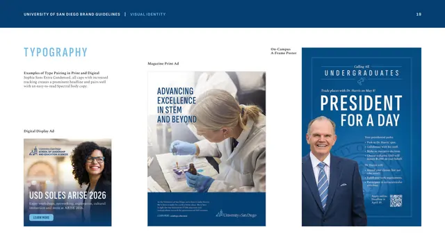
A clean model for documenting a two-font system on a single page. The condensed-sans-plus-serif combination is widely transferable to editorial, institutional, and editorial-marketing brands. Note the minor Sofia/Sophia spelling inconsistency in the source copy if quoting it. Pairs with the type-pairing examples page that follows.
From this deck: Typography, Sophia Sans and Spectral
View deck

More like this


Keep what you find
A free account saves references to boards and can send you a weekly email of picks based on what you save.
To see every result, go Pro.