Preview image. Unlock full-res
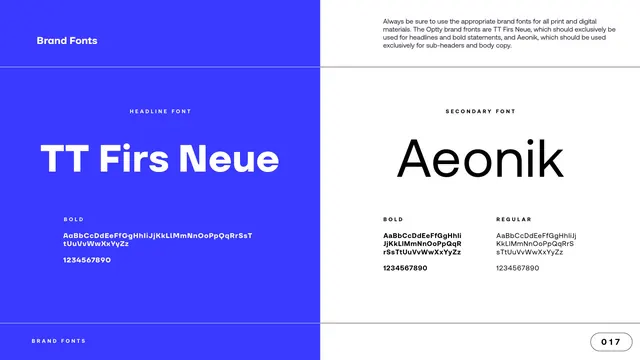
Typography page pairing TT Firs Neue for headlines on a blue panel with Aeonik for body on white, each shown with a character set.
Summary
The typography page: a two-font system split across the page, TT Firs Neue as the headline font on a blue panel and Aeonik as the secondary font on white, each with its specimen.
Visual description
A white content page with "Brand Fonts" top left and a paragraph top right stating the brand fonts are TT Firs Neue for headlines and bold statements and Aeonik for sub-headers and body copy. The page is split vertically. The left half is an electric-blue panel labeled "HEADLINE FONT", showing "TT Firs Neue" set large in white, with a "BOLD" character set (upper- and lowercase plus numerals) beneath. The right half is white, labeled "SECONDARY FONT", showing "Aeonik" set large in black, with two weights, "BOLD" and "REGULAR", each shown as a character set and numerals. The footer and "017" page pill close the page.
Key takeaway
Splitting the page into a colored headline-font panel and a white body-font panel makes the two-typeface roles legible at a glance, who leads, who supports. Showing full character sets and the available weights under each makes the page genuinely usable for production, not just decorative.
Reuse notes
A clean two-font typography spec. Pairing a distinctive geometric display sans for headlines with a neutral humanist sans for body is a safe, legible system; the colored-panel-versus-white split is the reusable layout move. Backgrounding the headline font in brand blue also previews how display type reads reversed.
From this deck: Brand Fonts, TT Firs Neue and Aeonik
View deck


More like this






Keep what you find
A free account saves references to boards and can send you a weekly email of picks based on what you save.
To see every result, go Pro.