Preview image. Unlock full-res
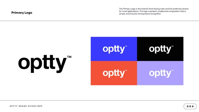
Primary logo page showing the black optty logotype at left and a four-tile grid of the logo on brand-color backgrounds at right.
Summary
The primary-logo page: the black "optty" logotype shown large at left, with a four-tile swatch grid demonstrating the logo on the brand colors at right.
Visual description
A white content page with the standard furniture: "Primary Logo" label at top left, a short intro paragraph at top right, and the "OPTTY BRAND GUIDELINES" footer with a "004" page pill at the bottom. The left half shows the wordmark "optty" in solid black, set in the heavy geometric sans with a superscript trademark. The right half is a tight two-by-two grid of equal rectangles, each carrying the white "optty" logotype on a different background: electric blue (top left), black (top right), orange (bottom left), and pale lavender (bottom right, where the logotype reads in white).
Key takeaway
Pairing one large hero lockup with a compact color-tile grid is an efficient way to show a logo and prove its flexibility across the palette in a single view. Keeping the tiles identical in size and the logo identically placed makes the color comparison clean.
Reuse notes
A standard primary-logo guideline layout that travels to any brand. Note the lavender tile pushes contrast: the white logotype on pale lavender is the weakest pairing on the page, worth flagging if accessibility matters.
From this deck: Primary Logo and color backgrounds
View deck




More like this

Keep what you find
A free account saves references to boards and can send you a weekly email of picks based on what you save.
To see every result, go Pro.