Preview image. Unlock full-res
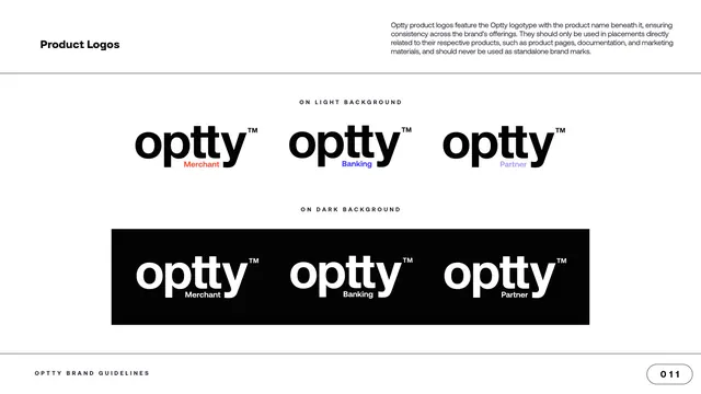
Product-logo page showing three sub-brand lockups (Merchant, Banking, Partner) on light and again reversed on a black band.
Summary
The product-logo page: three sub-brand lockups, Merchant, Banking and Partner, shown in a row on light and repeated reversed on a black band.
Visual description
A white content page with "Product Logos" top left and a paragraph top right explaining that product logos add the product name beneath the logotype and should only appear in product-specific placements. The upper row, labeled "ON LIGHT BACKGROUND", shows the black "optty" logotype three times, each with a small product descriptor in a brand color tucked under the wordmark: "Merchant" in orange, "Banking" in blue, "Partner" in lavender. The lower row, labeled "ON DARK BACKGROUND", repeats the three on a solid black band with the logotype in white and the descriptors in white. The footer and "011" page pill close the page.
Key takeaway
Adding a small color-coded product word beneath a shared wordmark is a compact sub-brand system: one master logotype flexes into a product family while staying clearly one brand. Color-coding each product to a palette swatch ties the sub-brands back to the master color system.
Reuse notes
Use when a parent brand has named product lines that need their own but related marks. The guidance that product logos must not be used as standalone brand marks is worth preserving so the sub-brands do not drift from the parent.
From this deck: Product Logos, Merchant Banking Partner
View deck


More like this



Keep what you find
A free account saves references to boards and can send you a weekly email of picks based on what you save.
To see every result, go Pro.