Preview image. Unlock full-res
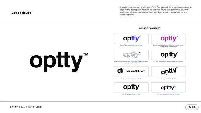
Logo-misuse page with the correct logotype large at left and an eight-cell grid of incorrect treatments, each captioned with a Do NOT rule.
Summary
The logo-misuse page: the correct black logotype shown large at left against a grid of eight incorrect treatments at right, each labeled with a "Do NOT" rule.
Visual description
A white content page with "Logo Misuse" top left and a paragraph top right warning against altering the logo. The left half shows the correct black "optty" logotype large as the reference. The right half, under a centered "MISUSE EXAMPLES" header, is a four-row, two-column grid of boxed cells, each showing a wrong version of the mark with a small caption: do not use multiple colors, do not use off-palette colors, do not outline, do not adjust kerning, do not compress or stretch, do not rotate, do not apply effects, do not change the font. The footer and "013" page pill close the page.
Key takeaway
Anchoring a dense grid of wrong examples to one large correct mark on the same page lets the eye check each violation against the reference instantly. Boxing each misuse in an identical cell with a single short caption keeps a long list of rules scannable.
Reuse notes
The standard "do not" page every logo guideline needs. Eight cells is a generous set covering color, geometry, kerning, effects and typeface; reuse the correct-versus-grid split so the contrast is always one glance away.
From this deck: Logo Misuse examples
View deck


More like this





Keep what you find
A free account saves references to boards and can send you a weekly email of picks based on what you save.
To see every result, go Pro.