Preview image. Unlock full-res
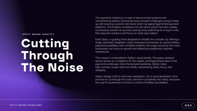
Brand mission page with an oversized three-line headline at left and a column of intro copy at right on a dark grainy purple field.
Summary
The brand-story opener, leading with an oversized headline "Cutting Through The Noise" set against a dark, grainy purple background, with the narrative copy in a column at right.
Visual description
A full-bleed dark background runs from near-black at the upper right to a glowing purple in the lower left, carrying the same film-grain texture as the cover and a soft abstract swirl. At left, a small spaced label "OPTTY BRAND IDENTITY" sits above a huge white three-line headline, "Cutting / Through / The Noise", in the heavy geometric sans. The right half holds four short paragraphs of white body copy describing the payments problem and Optty's positioning. A footer reads "OPTTY BRAND GUIDELINES" at bottom left, with a pill-shaped "002" page marker at bottom right.
Key takeaway
The split of one giant left-aligned headline against a quiet right-hand body column is a clean way to open a brand story. The grainy gradient is reused from the cover, tying the bookends to the narrative and reinforcing the "noise to clarity" idea as a literal texture.
Reuse notes
Good template for a mission or manifesto page where the headline should dominate and the supporting copy stays secondary. Needs enough copy to fill the right column; on a lighter system the same layout would invert to dark type on white.