Preview image. Unlock full-res
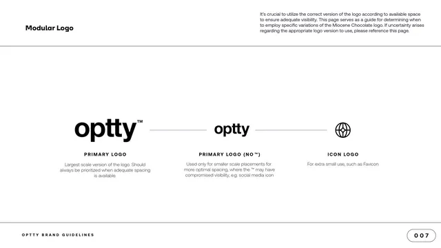
Modular-logo page showing three lockups in a row, the primary logotype, the logotype without trademark, and the icon, each with a usage caption.
Summary
The modular-logo page: three logo variants laid out left to right, from the full logotype down to the icon, with a short usage note under each.
Visual description
A white content page with "Modular Logo" top left and a paragraph top right. Across the middle, three black logo treatments sit in a row, separated by thin horizontal connector lines: the primary logotype "optty" with a superscript trademark, the same logotype without the trademark, and the standalone globe-and-star icon. Beneath each is a spaced all-caps label, "PRIMARY LOGO", "PRIMARY LOGO (NO TM)", "ICON LOGO", and a one-line description of when to use it (largest scale, smaller-scale placements, extra-small use such as favicon). The footer and "007" page pill close the page.
Key takeaway
Laying the variants out in descending size with connector lines reads as a single system stepping down from full to minimal, making the "use the biggest version that fits" rule obvious at a glance. The short per-variant captions answer the practical question of when to use each.
Reuse notes
A clean template for documenting a logo's responsive or modular set. One caveat: the body copy here references "the Miocene Chocolate logo", clearly leftover placeholder text from a reused template, so do not treat that copy as real Optty guidance.
From this deck: Modular Logo variants
View deck

More like this




Keep what you find
A free account saves references to boards and can send you a weekly email of picks based on what you save.
To see every result, go Pro.