Preview image. Unlock full-res
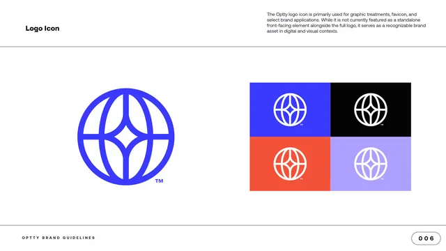
Logo-icon usage page with the blue globe-and-star mark large at left and a four-tile grid of the icon on brand-color backgrounds at right.
Summary
The logo-icon application page: the globe-and-star icon shown large in blue at left, with a four-tile grid placing the white icon on the brand-color backgrounds at right.
Visual description
A white content page with "Logo Icon" labeled top left and a paragraph top right noting the icon is used for graphic treatments, favicon and select applications rather than as a standalone front-facing mark. The left half shows the icon large in electric blue, a line globe framing a central four-point star, with a small superscript trademark. The right half is a two-by-two grid of equal tiles: the white icon on electric blue, on black, on orange, and on pale lavender, each with a small trademark. The "OPTTY BRAND GUIDELINES" footer and a "006" page pill close the page.
Key takeaway
Mirroring the primary-logo page's layout for the icon (hero mark at left, color-tile grid at right) keeps the guideline consistent and easy to scan. Reusing one grid pattern across logo and icon pages builds rhythm through the deck.
Reuse notes
Use when documenting an icon or favicon alongside the full logo. As on the primary-logo page, the white icon on pale lavender is the lowest-contrast tile; keep that pairing for low-stakes uses only.
From this deck: Logo Icon and color variations
View deck





More like this







Keep what you find
A free account saves references to boards and can send you a weekly email of picks based on what you save.
To see every result, go Pro.