Preview image. Unlock full-res
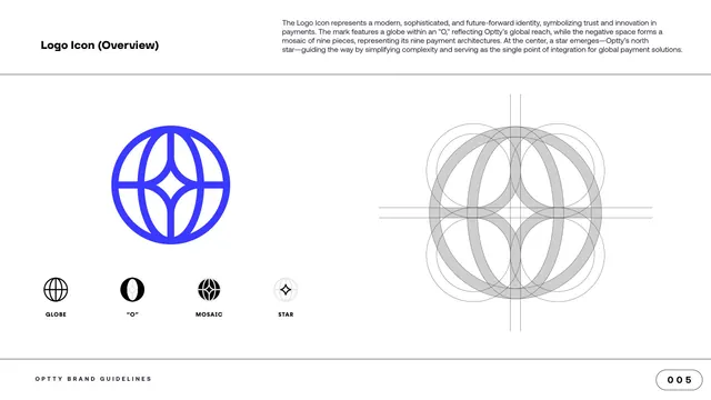
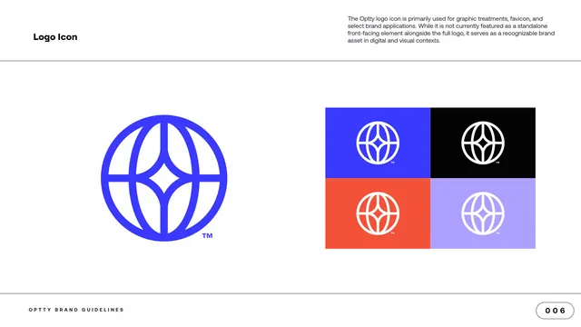
Logo-icon explainer showing the blue globe-and-star mark, its element breakdown (globe, O, mosaic, star), and a circle-based construction grid.
Summary
The logo-icon overview: the electric-blue globe-and-star mark shown large at left over a four-part element breakdown, with its circle-based construction grid at right.
Visual description
A white content page with the "Logo Icon (Overview)" label top left and an explanatory paragraph top right describing a globe within an "O", a nine-piece mosaic in the negative space, and a central star as the brand's north star. The left half shows the icon large in electric blue: a line-drawn globe with curved latitude and longitude lines that frame a four-point star at the center. Below it sit four small black thumbnails in a row, each labeled in spaced caps: GLOBE, "O", MOSAIC, STAR, isolating each idea inside the mark. The right half shows the same mark rendered in grey as an overlapping-circles construction geometry with crosshair guide lines, demonstrating how the icon is built.
Key takeaway
Breaking a single mark into its conceptual parts (globe, O, mosaic, star) as a row of small thumbnails is a clear way to explain symbolism without a wall of text. Pairing the finished icon with its circle-construction geometry signals rigor and helps anyone rebuild it precisely.
Reuse notes
A strong template for any logo-rationale page where the mark carries layered meaning. The construction grid is most convincing when the icon is genuinely built on circles, as here; reuse the side-by-side of finished mark plus geometry to communicate craft.
From this deck: Logo Icon overview and construction
View deck




More like this







Keep what you find
A free account saves references to boards and can send you a weekly email of picks based on what you save.
To see every result, go Pro.