Preview image. Unlock full-res
Full-bleed electric-blue divider with LOGO in large white all-caps anchored to the lower left.
Styleminimal, swiss, corporate-clean
Colorvibrant, high-contrast, cool
Typesans-serif, oversized, all-caps
Moodbold, professional
Palette
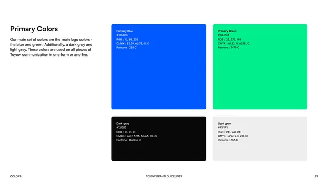
#1058FC
#FFFFFF
Summary
The Logo section divider, a full-bleed blue page with the section title in the lower-left corner.
Visual description
The whole page is a flat electric-blue field. "LOGO" is set in large bold white all-caps sans, anchored to the lower-left corner above the footer. The footer reads "LOGO", "TOYOW BRAND GUIDELINES", and page number 14 in small white type. No other elements.
Key takeaway
The identical lower-left title-on-blue treatment reused for every section keeps the deck's navigation consistent and recognizable.
Reuse notes
One of the recurring divider pages. Its sameness across sections is the point: it signals "new chapter" without redesign.