Preview image. Unlock full-res
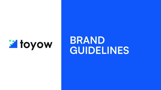
Split-screen cover with the Toyow logo on a white left half and BRAND GUIDELINES in white all-caps on an electric-blue right half.
Summary
The deck cover, split vertically into a white left half holding the logo and an electric-blue right half holding the title.
Visual description
A hard vertical split divides the page in two. The left half is white and centers the Toyow lockup: a pixel-stair icon in blue and green squares next to the lowercase "toyow" wordmark in black. The right half is a flat electric-blue field with "BRAND GUIDELINES" set in two lines of bold white all-caps sans, left-aligned and vertically centered. No other elements, footer, or page number appear.
Key takeaway
The 50/50 vertical split that lets the brand color and the logo each own a full half of the frame is a confident, instantly legible cover device. Holding the logo on white and the title on color keeps both maximally readable.
Reuse notes
A reliable cover pattern for any guideline or pitch deck with a strong single brand color. Works best when the wordmark reads cleanly at large size on a plain ground, as it does here.
From this deck: Toyow cover - split logo and brand guidelines title
View deck
More like this





Keep what you find
A free account saves references to boards and can send you a weekly email of picks based on what you save.
To see every result, go Pro.