Preview image. Unlock full-res
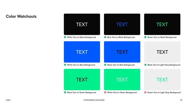
Nine-cell contrast grid showing approved and rejected text/background color pairings using TEXT samples and pass/fail icons.
Summary
The Color Watchouts page, a contrast matrix of approved and forbidden text-on-background color combinations.
Visual description
"Color Watchouts" is the bold black left label. The right side is a three-by-three grid of rounded cards, each showing the word "TEXT" in one color on a colored background, captioned with a green check or red cross: white/blue/green text on black (all approved), white and black text on blue (approved), black text on light gray (approved), black text on green (approved), then white text on green and green text on light gray (both rejected for poor contrast). Footer with page 25.
Key takeaway
A pass/fail contrast grid using a literal "TEXT" sample, green checks, and red crosses turns accessibility guidance into an at-a-glance lookup table.
Reuse notes
Reuse for any palette where some color pairings fail legibility. The check/cross grid is a clear, non-technical way to enforce contrast rules.
From this deck: Toyow color watchouts (contrast pairings)
View deck


More like this




Keep what you find
A free account saves references to boards and can send you a weekly email of picks based on what you save.
To see every result, go Pro.