Preview image. Unlock full-res
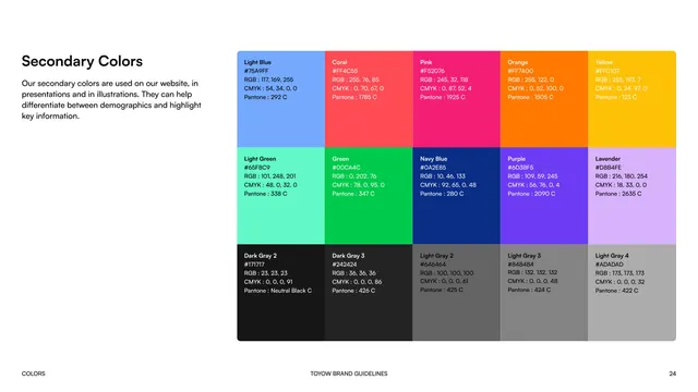
Fifteen-swatch secondary palette in a 5x3 grid spanning brights and grays, each with hex/RGB/CMYK/Pantone specs.
Summary
The Secondary Colors page, an extended fifteen-color palette for web, presentations, and illustration.
Visual description
"Secondary Colors" is the bold black left label with a note that these colors differentiate demographics and highlight key information. The right side is a five-column, three-row grid of rectangular swatches. The top row runs bright (Light Blue, Coral, Pink, Orange, Yellow); the middle row adds Light Green, Green, Navy Blue, Purple, and Lavender; the bottom row is a five-step gray ramp (Dark Gray 2 and 3, Light Gray 2, 3, and 4). Every swatch is annotated with name, hex, RGB, CMYK, and Pantone. Footer with page 24.
Key takeaway
A full five-by-three secondary system, organized into a brights row, an accent row, and a neutral gray ramp, gives illustrators a rich but governed palette beyond the two-color core.
Reuse notes
Useful when a minimal core palette needs an expanded set for data, illustration, or demographic coding. Grouping by brights versus a gray ramp keeps a large palette legible.
From this deck: Toyow secondary colors
View deck


More like this




Keep what you find
A free account saves references to boards and can send you a weekly email of picks based on what you save.
To see every result, go Pro.