
Preview image. Unlock full-res
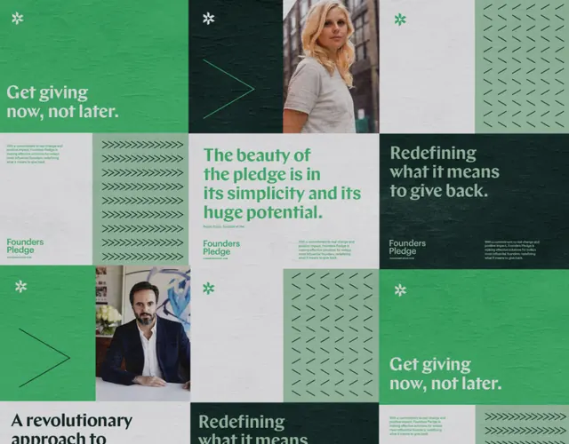
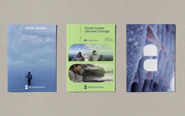
Clean editorial composition balancing soft cream typography against muted blue and gray tones with strategic white space.
Summary
An editorial layout using a sophisticated color palette of cool blues, grays, and creams. Typography is clear and generous, arranged in a balanced grid with ample negative space.
Visual description
Soft cream background dominates. Dark blue-gray type sits prominently. Muted slate and dusty blue accent areas appear as subtle blocks or sections. The typography is clean sans-serif in various weights, creating hierarchy through size rather than color. Overall composition is perfectly balanced with significant white space. The color palette feels natural and calming.
Key takeaway
Sophisticated color combinations using multiple cool tones in varying saturation. White space as a design element is as important as the type and color.
Reuse notes
Strong for corporate communications, editorial design, or professional services. The cool, muted palette conveys trust and stability. Works well for B2B marketing, annual reports, or institutional branding.
More like this








Keep what you find
A free account saves references to boards and can send you a weekly email of picks based on what you save.
To see every result, go Pro.