Preview image. Unlock full-res
Lime-green chapter opener with an oversized two-line serif title and a single large white organic shape carved out of the right side.
Summary
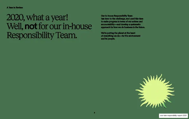
A section divider: an oversized two-line serif "A Year in Review" sits on a lime-green field, with a single large white organic shape sweeping in from the right.
Visual description
Light lime-green full bleed. An oversized high-contrast serif title, "A Year / in Review", fills the upper-left in near-black, left-aligned across two lines. A large smooth white organic shape enters from the right edge and curves down through the lower-right quadrant, leaving the title side open. No other elements.
Key takeaway
The minimal chapter opener: one oversized serif title plus one big organic shape doing all the work. The white shape against lime is a simple, repeatable divider device that signals "new section" without a heading system.
Reuse notes
Use as a recurring section divider across a long report; vary the shape position per chapter to keep it fresh while the type style stays fixed. Best when the title is short enough to set very large. The pure two-color treatment makes it a clean palette cleanser between dense spreads.
From this deck: A Year in Review chapter opener
View deck