Preview image. Unlock full-res
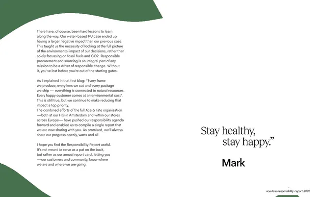
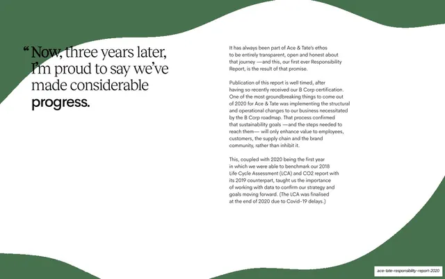
White spread with a serif sub-headline left and two columns of small sans-serif body copy right, framed top and bottom by green organic waves.
Summary
A continuation of the founder letter: a serif sub-headline on the left faces a block of small-set sans-serif body copy on the right, bracketed by green organic wave shapes top and bottom.
Visual description
White background framed by deep-green organic wave shapes bleeding in from the top and bottom edges. Left, a serif sub-headline reads "Now, three years later, I'm proud to say we've made considerable progress." with "Now" and "progress." emphasized. Right, a single column of small sans-serif body copy in several paragraphs about transparency, B Corp certification, and benchmarking 2018 and 2019 data. The layout is heavily left-weighted with a large quiet lower area.
Key takeaway
Using green organic waves as a top-and-bottom frame to carry the deck's identity onto an otherwise plain white text spread. The serif headline vs small sans body split keeps a dense letter readable.
Reuse notes
A workhorse layout for the body of a report or letter where you have real reading copy but still want brand presence. The wave frame ties it to the rest of the system; drop the waves and it reads generic. Best with restrained copy length so the lower half can breathe.
From this deck: Considerable progress letter spread
View deck