Preview image. Unlock full-res
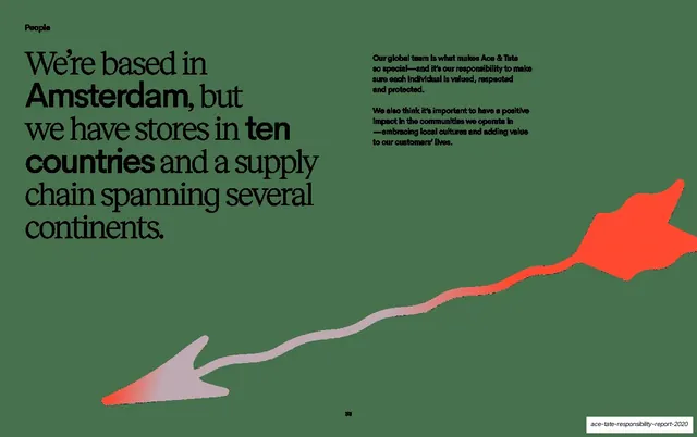
A dark spread with a large serif statement about being Amsterdam-based across ten countries, a short body note at right, and a long red gradient arrow sweeping across the lower half.
Summary
A statement spread on a dark green-grey field, leading with an oversized serif sentence about Ace and Tate's Amsterdam base and global reach, with a short supporting note and a long red gradient arrow sweeping the lower half.
Visual description
Dark green-grey background. The left half carries a large multi-line serif statement, "We're based in Amsterdam, but we have stores in ten countries and a supply chain spanning several continents.", with "Amsterdam,", "ten" and "countries" set in heavier bold weight for emphasis. The upper-right holds two short sans-serif paragraphs about valuing the global team and local communities. A long, hand-drawn arrow sweeps diagonally across the lower half from a small arrowhead at bottom-left up to a large red arrowhead at right, its shaft fading from grey into red. Page number 33 is centered at the bottom.
Key takeaway
The pull-quote statement layout again, now on a dark field with selective bold words inside the serif sentence carrying the emphasis. The single sweeping arrow doubles as both decoration and a visual gesture of reach across continents.
Reuse notes
Reuse for a values or positioning statement that introduces a section, especially where one sentence with a few emphasized words should dominate. The bold-words-inside-serif trick recurs across this deck's statement pages. The arrow motif is a flexible way to suggest direction or scale on an otherwise empty field.
From this deck: People based in Amsterdam statement, red arrow
View deck