Preview image. Unlock full-res
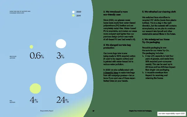
A blue-and-green split spread comparing recycled and bio acetate use in 2019 versus 2020 with sized bubbles, beside three columns of packaging-change body copy.
Summary
A comparison spread charting recycled versus bio acetate use across 2019 and 2020 with proportionally sized bubbles and a small color legend, paired with three columns of packaging-improvement copy.
Visual description
The left half is a light-blue field carrying a small header "HOW OUR USE OF ACETATE HAS CHANGED SINCE 2019" and a two-dot legend, white for 2020 and lime-green for 2019. Below, four bubbles of different sizes are arranged in two rows labelled "RECYCLED ACETATE" and "BIO ACETATE": small lime "0.6%" and white "3%" on top, lime "4%" and a large white "24%" below, the sizes encoding each share. The right half sits on a green field with three columns of small sans-serif body copy (numbered points 3 to 6) about eco-friendly cases, tote bags, cleaning cloth and Home Try-On packaging. A thin footer shows "Responsibility Report", page 27, "Chapter Two: Product and Packaging".
Key takeaway
Encoding a simple year-over-year comparison as two-color sized bubbles with a tiny legend, so growth reads visually before you reach the numbers. Splitting the page into a blue chart half and a green text half also doubles as visual structure.
Reuse notes
Good for before/after or year-over-year metrics where only a few values are compared. The two-color legend plus sized bubbles is reusable and compact. The blue/green half-and-half split provides easy structure when a page must hold both a chart and a block of detail copy.
From this deck: Product acetate change, bubble comparison
View deck




More like this





Keep what you find
A free account saves references to boards and can send you a weekly email of picks based on what you save.
To see every result, go Pro.